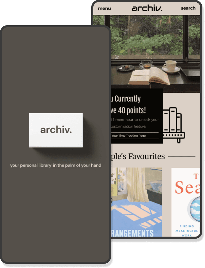
your personal library in the palm of your hand
your personal library in the palm of your hand
ARCHIV.
ARCHIV.
ARCHIV.
ux/ui case study
ux/ui case study
ux/ui case study
THE PRODUCT
THE PRODUCT
A mobile app designed to enhance reading by leveraging ai to transform the book industry and elevate the reading experience
A mobile app designed to enhance reading by leveraging ai to transform the book industry and elevate the reading experience
PROJECT DURATION
PROJECT DURATION
april 2023 - august 2023
april 2023 - august 2023
MY ROLE
MY ROLE
UX/UI designer, UX researcher
UX/UI designer, UX researcher
RESPONSIBILITIES
RESPONSIBILITIES
Conducted Literature Review And Competitive Analysis
Conducted user research
Defined the problem and provided insights to inform the ideation phase
Created personas, user journeys, empathy maps and user flows
Visual design of low-fi and high-fi wireframes, prototypes, and user testing
Developed the entire application from scratch


BACKGROUND
BACKGROUND
The publishing industry, unlike retail, has managed to retain its traditional roots despite the rise of technology. While print books remain popular, there's immense potential for technology to enhance the reading and learning experience without replacing printed books entirely. This project aims to leverage AI to improve e-learning and the publishing industry, creating a more immersive and accessible experience for readers. By integrating AI, we can transform the way readers engage with content while preserving the value of physical books, striking a balance between tradition and innovation.
THE PROBLEM
THE PROBLEM
Many readers hesitate to adopt e-books and other digital reading solutions. Despite technological advancements in the book industry, physical books remain more popular, as readers feel there are no significant benefits to switching to digital formats.
Many readers hesitate to adopt e-books and other digital reading solutions. Despite technological advancements in the book industry, physical books remain more popular, as readers feel there are no significant benefits to switching to digital formats.
THE GOAL
THE GOAL
The AI app aims to provide a versatile digital library with features like translation, audiobooks, customisation options, and more. It will be available on iOS and Android and include book statistics, reading time tracking through gamification, UI customisation, reviews, and forums for user interaction
The AI app aims to provide a versatile digital library with features like translation, audiobooks, customisation options, and more. It will be available on iOS and Android and include book statistics, reading time tracking through gamification, UI customisation, reviews, and forums for user interaction
COMPETITIVE AUDIT
COMPETITIVE AUDIT
A comprehensive competitive audit was carried out to gain a deeper understanding of the strengths and weaknesses of these existing book applications. It also gives me an opportunity to gain insights into best practices, identify industry trends, and make informed decisions regarding the design process, taking into account what to adopt and what to avoid.


UNDERSTANDING THE USER
UNDERSTANDING THE USER
To understand user frustration, needs, and requirements, I conducted user research through a user survey and structured interviews for my project. This step is particularly very useful to meet the project objectives as the data gathered will be highly beneficial in gaining further insights into the user’s experience within the book industry and on how to improve it.
An online survey was conducted, involving 148 participants. The objective of this research was to delve into the participants' specific pain points and motivations concerning their reading experiences. The survey consisted a range of inquiries, including general questions about participants' reading preferences and their attitudes toward different types of books and reading platforms
Three individual interviews were conducted where the participants were within the age range of 21-27, who came from different backgrounds. Although our primary emphasis was on gaining a deeper understanding of their requirements, objectives, and challenges in their reading experience, the various viewpoints they brought forth yielded a variety of valuable insights.
PAIN POINT 1
PAIN POINT 1
Difficulty remembering characters, leading to frequent backtracking to previous chapters for clarity
Difficulty remembering characters, leading to frequent backtracking to previous chapters for clarity
The design will have a feature that provides detailed character information, eliminating the need to backtrack.
The design will have a feature that provides detailed character information, eliminating the need to backtrack.
PAIN POINT 2
PAIN POINT 2
gets easily distracted when using reading apps, resulting in frequent app switching
The design will incorporate a gamification feature to encourage consistent reading habits and reduce distractions from other apps
The design will incorporate a gamification feature to encourage consistent reading habits and reduce distractions from other apps
PAIN POINT 3
PAIN POINT 3
Physical books can be challenging for individuals with visual impairments
Physical books can be challenging for individuals with visual impairments
To address this, the design will allow users to tailor the reading experience to their preferences such as font sizes and colours
To address this, the design will allow users to tailor the reading experience to their preferences such as font sizes and colours
PAIN POINT 4
PAIN POINT 4
UNABLE TO pre-read sections of a book, AS CHOOSING A BOOK IS A COMMITMENT
The design will enable users to preview sections of a book while browsing, allowing them to make informed decisions before purchasing
The design will enable users to preview sections of a book while browsing, allowing them to make informed decisions before purchasing
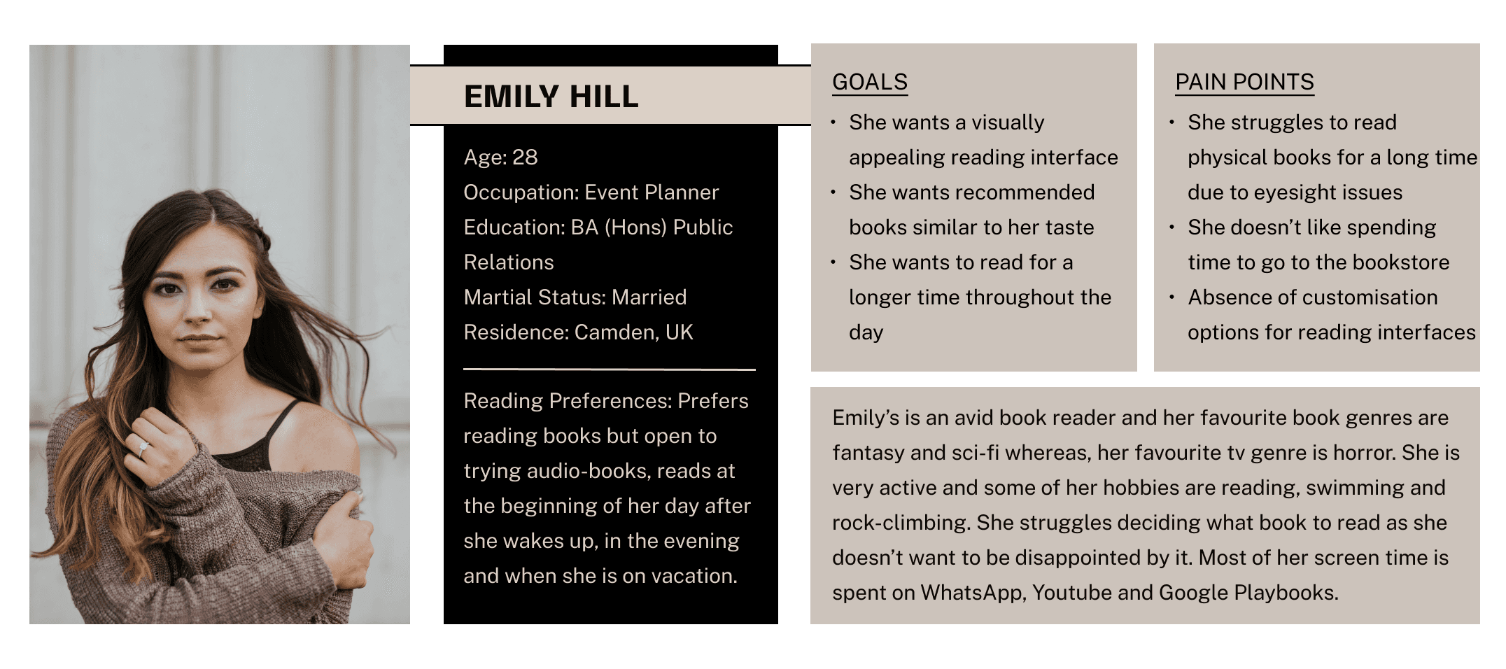
USER PERSONA 1
USER PERSONA 1
Problem Statement: Minh needs a reading solution that enhances his vocabulary, offers aesthetic customisations, and promotes consistency. He struggles to remember what he reads, feels overwhelmed by the commitment of choosing books, and has a short attention span.
Problem Statement: Minh needs a reading solution that enhances his vocabulary, offers aesthetic customisations, and promotes consistency. He struggles to remember what he reads, feels overwhelmed by the commitment of choosing books, and has a short attention span.


USER PERSONA 2
USER PERSONA 2
Problem Statement: Daisuke needs a reliable shopping platform that provides good quality products with clear product details and pricing. Frustrated by unclear seller trustworthiness, he seeks a more transparent and efficient shopping experience that allow him to donate to others
Problem Statement: Daisuke needs a reliable shopping platform that provides good quality products with clear product details and pricing. Frustrated by unclear seller trustworthiness, he seeks a more transparent and efficient shopping experience that allow him to donate to others


USER JOURNEY MAP
USER JOURNEY MAP
USER JOURNEY MAP
Goal: To trade her unwanted items for something more useful, creating a mutually beneficial exchange with others in the community.
Goal: To trade her unwanted items for something more useful, creating a mutually beneficial exchange with others in the community.
Goal: To trade her unwanted items for something more useful, creating a mutually beneficial exchange with others in the community.
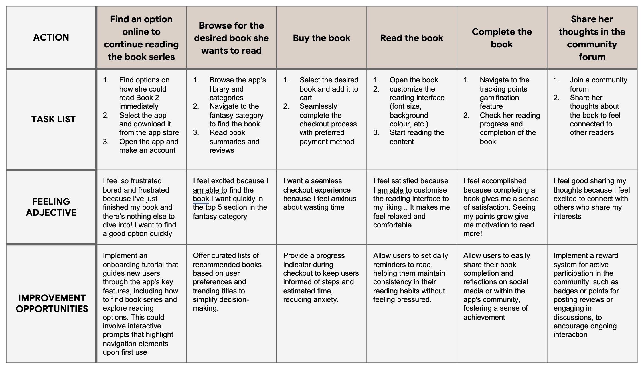


I created user journey map to illustrate Sarah’s actions, feelings, and thoughts as she exchanges items, intending to identify pain points and create opportunities for positive experiences.
I created user journey map to illustrate Sarah’s actions, feelings, and thoughts as she exchanges items, intending to identify pain points and create opportunities for positive experiences.
I created user journey map to illustrate Sarah’s actions, feelings, and thoughts as she exchanges items, intending to identify pain points and create opportunities for positive experiences.
STARTING THE DESIGN
STARTING THE DESIGN
I focused on several key tasks to build a solid foundation for the app. I began by creating a sitemap to establish the overall structure and navigation flow. Next, I sketched paper wireframes to brainstorm and visualise initial design ideas, which then evolved into digital wireframes that refined the layout and functionality.
These wireframes were used to develop a low-fidelity prototype, allowing for early user interaction and feedback. Finally, I conducted usability studies to test and gather insights, ensuring the design met user needs and expectations
SITEMAP
SITEMAP
SITEMAP
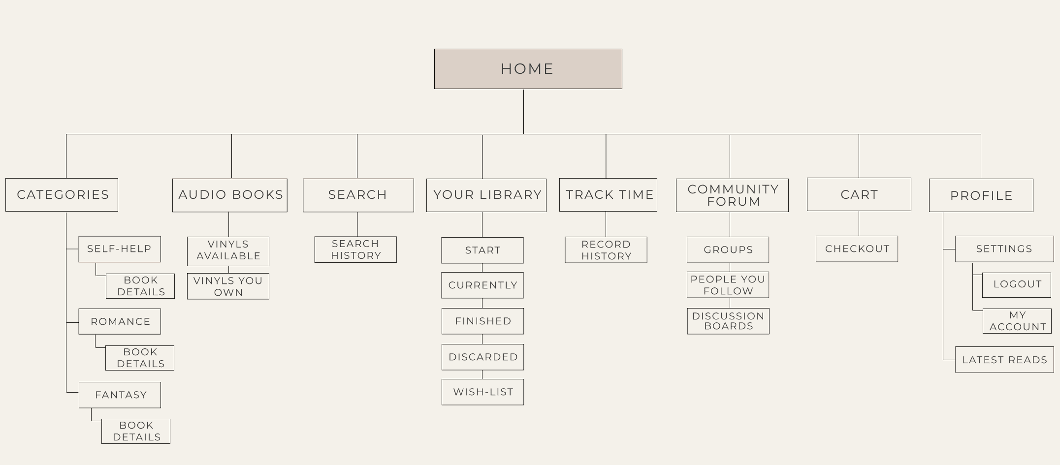
I built a sitemap to better visualise the clear content hierarchy, enhanced navigation and SEO. It also allowed me to further identify gaps in meeting users’ needs.
I built a sitemap to better visualise the clear content hierarchy, enhanced navigation and SEO. It also allowed me to further identify gaps in meeting users’ needs.
I built a sitemap to better visualise the clear content hierarchy, enhanced navigation and SEO. It also allowed me to further identify gaps in meeting users’ needs.


PAPER WIREFRAMES
PAPER WIREFRAMES
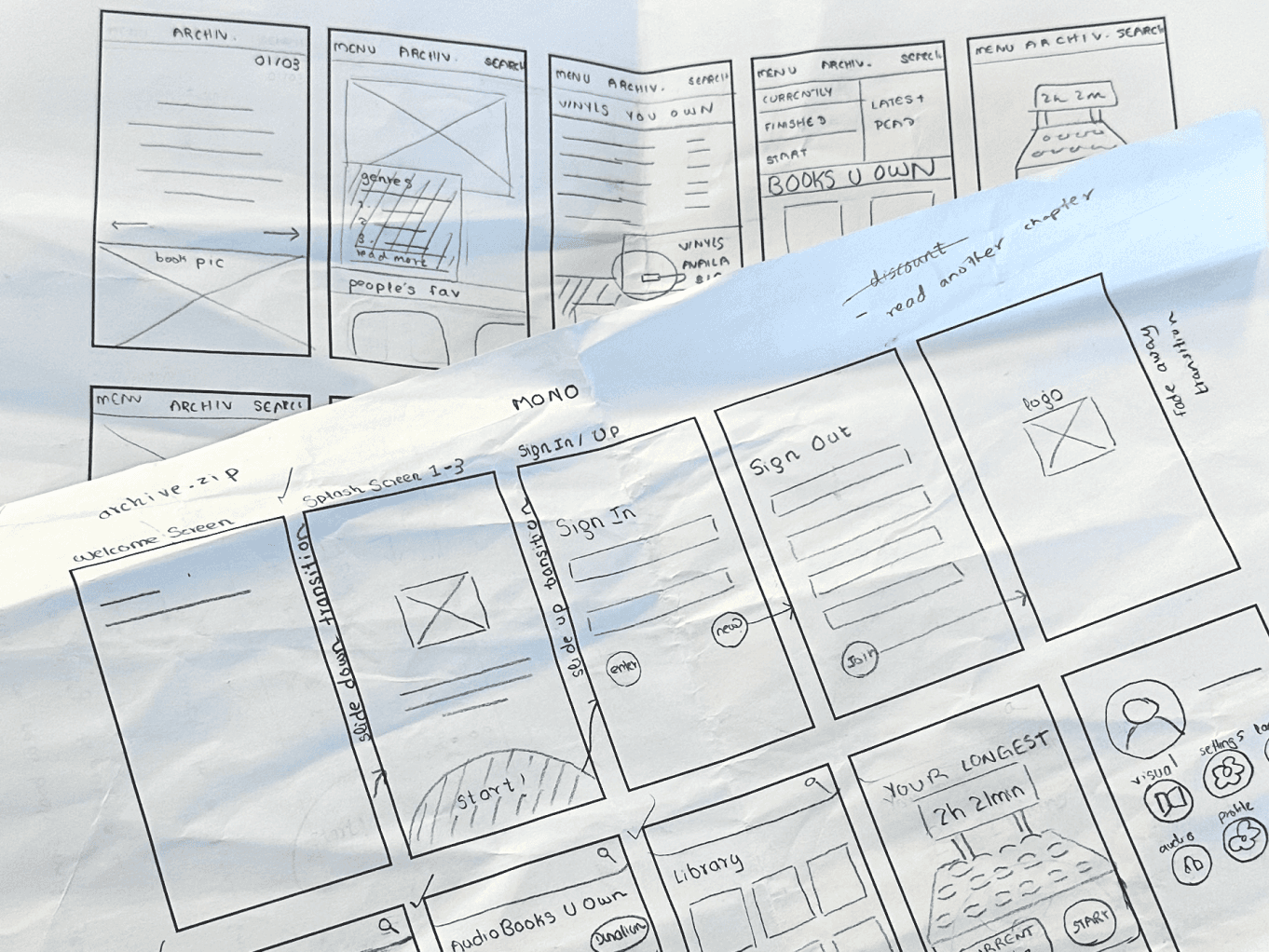
I created paper wireframes as a preliminary step in the design process to quickly explore and visualise different layout ideas without the constraints of digital tools. This hands-on approach allowed me to focus on the overall structure and functionality of the app, facilitating rapid iterations based on feedback.
I created paper wireframes as a preliminary step in the design process to quickly explore and visualise different layout ideas without the constraints of digital tools. This hands-on approach allowed me to focus on the overall structure and functionality of the app, facilitating rapid iterations based on feedback.


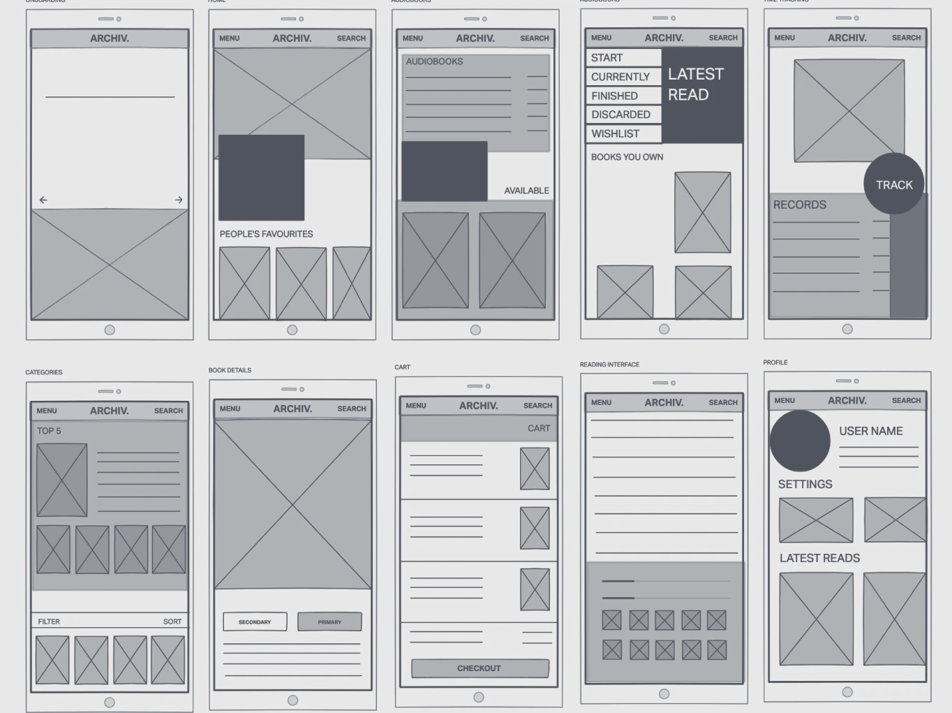
DIGITAL WIREFRAMES
DIGITAL WIREFRAMES
The primary goal was to create a simple and intuitive user interface that enhances the overall user journey. By priortising clarity and ease of use, the design aims for an efficient navigation to ensure that users can quickly access and complete their tasks.
The primary goal was to create a simple and intuitive user interface that enhances the overall user journey. By priortising clarity and ease of use, the design aims for an efficient navigation to ensure that users can quickly access and complete their tasks.


USABILITY STUDY
USABILITY STUDY
STUDY TYPE
STUDY TYPE
Unmoderated Usability Study
Unmoderated Usability Study
LOCATION
LOCATION
Sheffield, United Kingdom (Remote)
Sheffield, United Kingdom (Remote)
PARTICIPANTS
PARTICIPANTS
30 Participants
30 Participants
LENGTH
LENGTH
10-20 minutes
10-20 minutes
The purpose of this survey was to gather user feedback on the design solution to further improve it for a better user experience. In order to ensure that the survey is questioning the intended audience, the survey starts with a few screener questions about their demographics and behaviours first. This step is important when conducting a survey as it helps filter out participants that are not aligning with our requirements
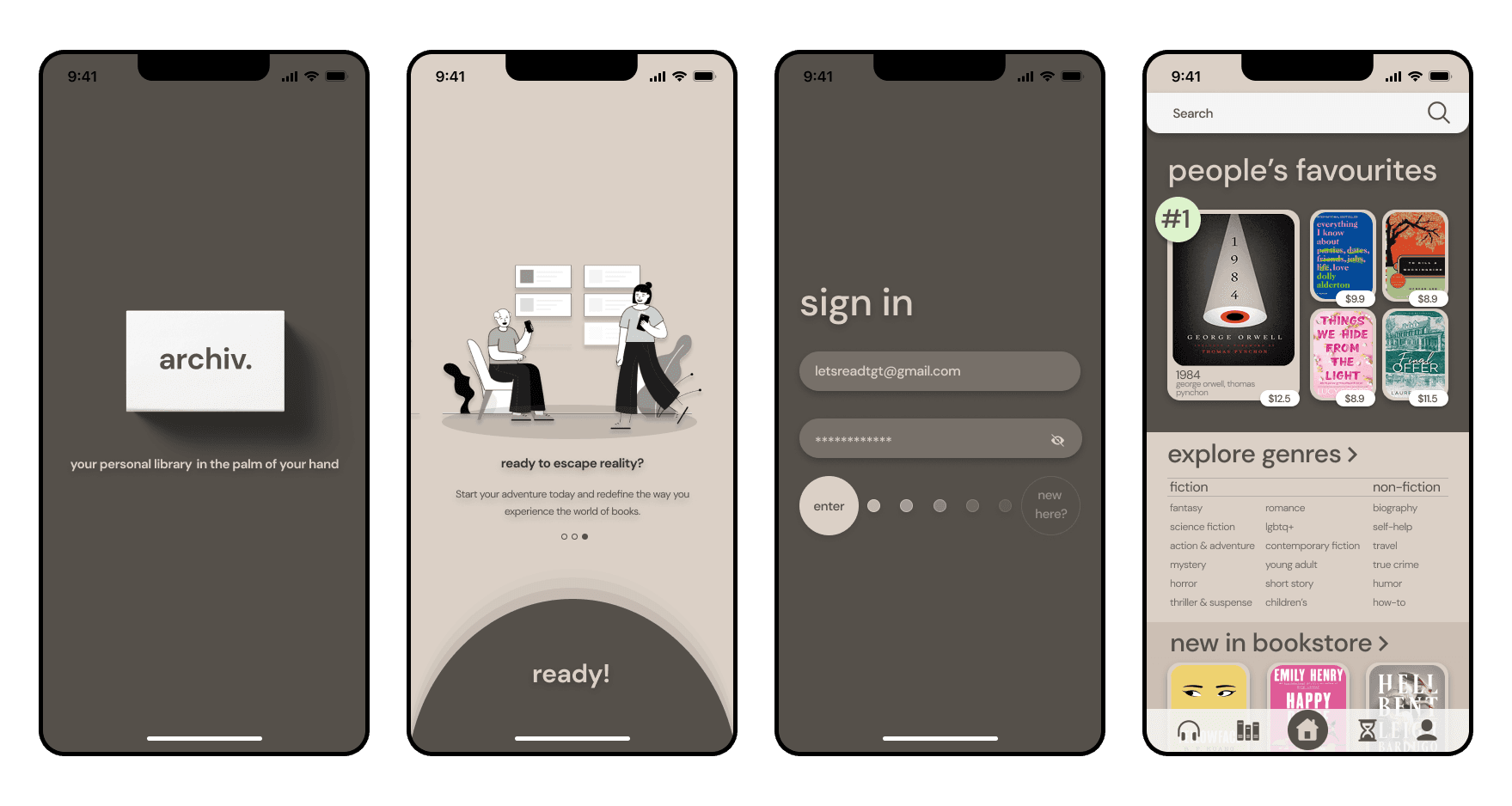
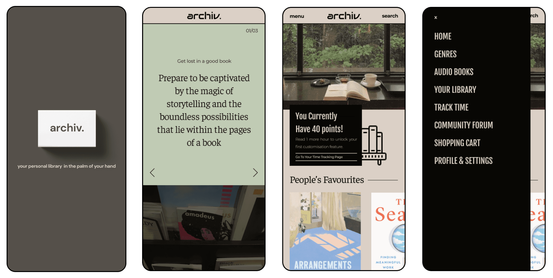
To determine the best solution for the users, A/B testing was carried out as part of the study. A second design solution was also presented and participants were tasked with indicating their preference between the two versions.
VERSION 1
VERSION 1


VERSION 2
VERSION 2


FINDING 1
FINDING 1
Some users found certain sections difficult to navigate, noting they were unaware they could scroll further or swipe left and right for additional content.
FINDING 2
FINDING 2
Older participants (ages 25-50 and above) showed a stronger preference for usability-focused design, while younger participants (ages 18-25) leaned toward aesthetically pleasing designs, highlighting generational differences in design priorities
Older participants (ages 25-50 and above) showed a stronger preference for usability-focused design, while younger participants (ages 18-25) leaned toward aesthetically pleasing designs, highlighting generational differences in design priorities
FINDING 3
FINDING 3
Users indicated that having access to the top books in each category would help them stay updated with current book trends.
Users indicated that having access to the top books in each category would help them stay updated with current book trends.
MOCKUPS: BEFORE AND AFTER USABILITY STUDY
MOCKUPS: BEFORE AND AFTER USABILITY STUDY
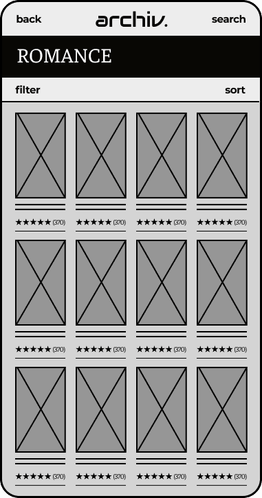
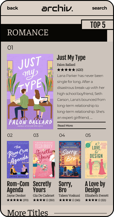
I introduced a "Top 5" section at the top of each category page to help users stay informed about the latest book trends. The top-ranked book is featured prominently, with a larger display and a brief synopsis, while users can easily scroll down to explore the rest of the books in the category
I introduced a "Top 5" section at the top of each category page to help users stay informed about the latest book trends. The top-ranked book is featured prominently, with a larger display and a brief synopsis, while users can easily scroll down to explore the rest of the books in the category
BEFORE
BEFORE


AFTER
AFTER


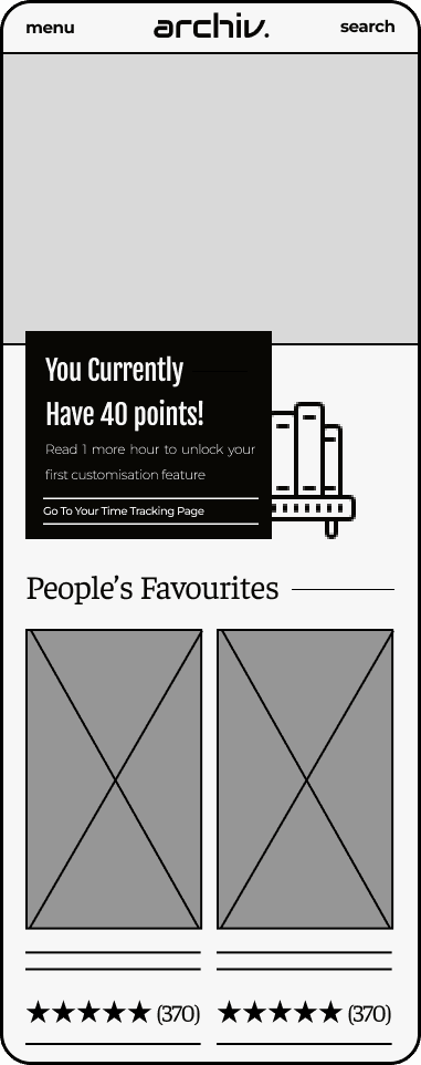
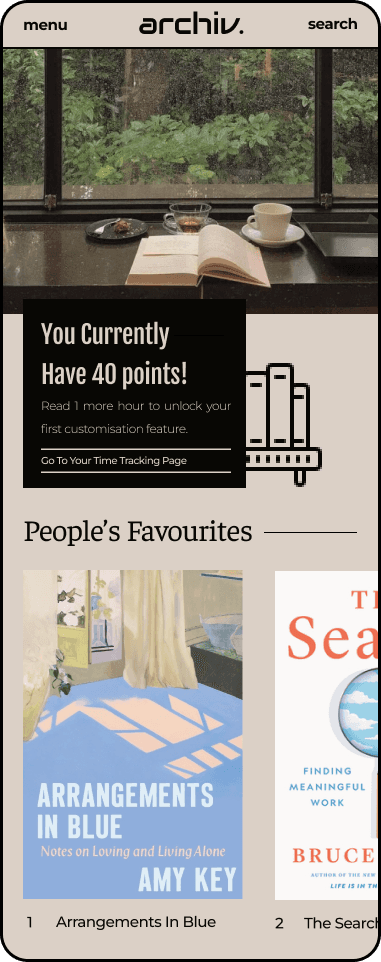
On the home page, some users didn’t realise they could scroll horizontally to see more content in the "People's Favourites" section. To address this, I enlarged the book display, intentionally cutting off part of the books, signaling that more content is available by scrolling. This not only enhances the visual cue but also creates a more engaging user experience, allowing users to quickly glance at a variety of books and easily explore further options.
On the home page, some users didn’t realise they could scroll horizontally to see more content in the "People's Favourites" section. To address this, I enlarged the book display, intentionally cutting off part of the books, signaling that more content is available by scrolling. This not only enhances the visual cue but also creates a more engaging user experience, allowing users to quickly glance at a variety of books and easily explore further options.
BEFORE
BEFORE


AFTER
AFTER


ACCESSIBILITY CONSIDERATIONS
ACCESSIBILITY CONSIDERATIONS
1
The bold and contrasting elements of the brutalist design improve accessibility by helping users quickly locate information. This clear visual hierarchy aids individuals with visual impairments or cognitive challenges
The bold and contrasting elements of the brutalist design improve accessibility by helping users quickly locate information. This clear visual hierarchy aids individuals with visual impairments or cognitive challenges
2
The app provides customisable font sizes and colour schemes to enhance readability for users with visual impairments, ensuring a more accessible and comfortable reading experience.
The app provides customisable font sizes and colour schemes to enhance readability for users with visual impairments, ensuring a more accessible and comfortable reading experience.
3
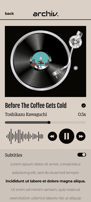
The audiobook feature enhances accessibility by providing an alternative for users with visual impairments or reading difficulties, allowing them to engage with content through listening
The audiobook feature enhances accessibility by providing an alternative for users with visual impairments or reading difficulties, allowing them to engage with content through listening
FINAL
FINAL
MOCKUP DESIGNS
MOCKUP DESIGNS


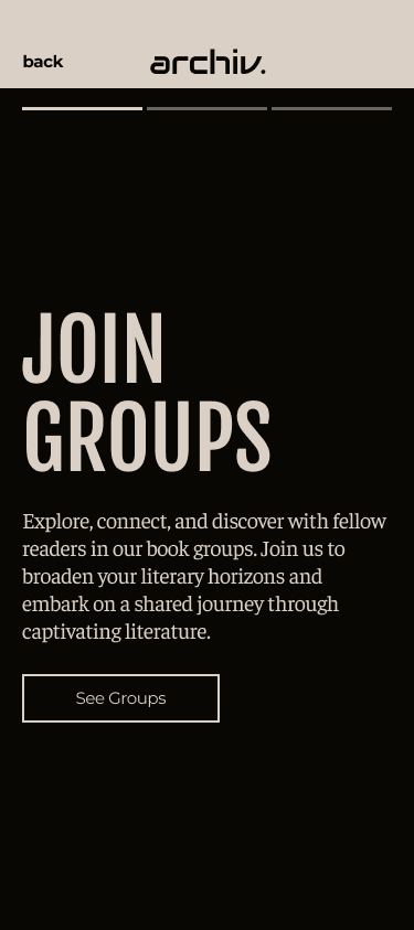


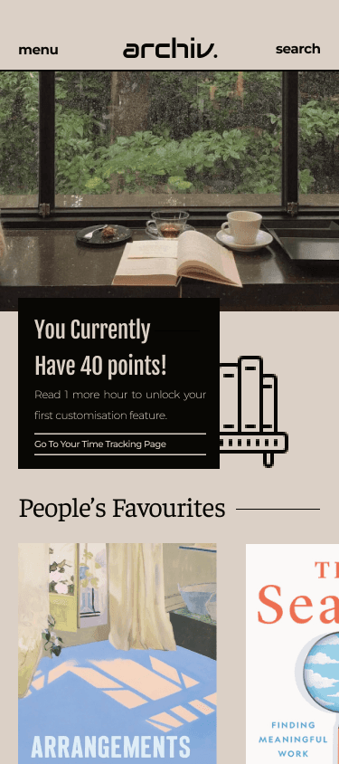


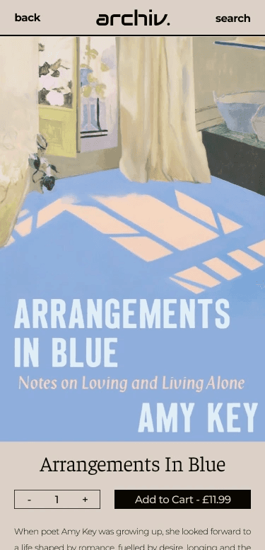


HIGH-FIDELITY PROTOTYPE
HIGH-FIDELITY PROTOTYPE
HIGH-FIDELITY PROTOTYPE
IMPACT
IMPACT
Survey participants shared their anticipated usage of the application, with 55.5% indicating they would use it daily or 2-3 times a week, reflecting strong engagement potential. Meanwhile, 20% planned to use it sparingly, with some expressing limited familiarity with Kindle, highlighting an opportunity to boost adoption by increasing their understanding of digital reading
"It is very quick and easy to navigate, even faster than Kindle. The layout is clear and very well done."
HOW I FEEL TOWARDS THIS PROJECT
HOW I FEEL TOWARDS THIS PROJECT
This project is really special to me as I've mostly only designed standard designs and haven't experimented with a design out of my comfort zone, therefore, I thoroughly enjoyed all the steps during this project. I believe I gained valuable insights into the significance of striking a balance between usability and aesthetics, revealing the close connection between design aesthetics and users' emotions.
This project is really special to me as I've mostly only designed standard designs and haven't experimented with a design out of my comfort zone, therefore, I thoroughly enjoyed all the steps during this project. I believe I gained valuable insights into the significance of striking a balance between usability and aesthetics, revealing the close connection between design aesthetics and users' emotions.
WHAT WOULD I HAVE DONE DIFFERENTLY?
WHAT WOULD I HAVE DONE DIFFERENTLY?
Because of time limitations, the generative survey covered a wider range, and it was previously determined that design refinements and optimisations following usability testing would not be included in this phase but would instead inform future work. If more time were available, I would have conducted a more comprehensive user research and tailored the design based on the usability test results.
Because of time limitations, the generative survey covered a wider range, and it was previously determined that design refinements and optimisations following usability testing would not be included in this phase but would instead inform future work. If more time were available, I would have conducted a more comprehensive user research and tailored the design based on the usability test results.
SEE OTHER PROJECTS
SEE OTHER PROJECTS
