REBRAND AND REDESIGN OF A GUITARIST'S WEBSITE

REBRAND AND REDESIGN OF A GUITARIST'S WEBSITE

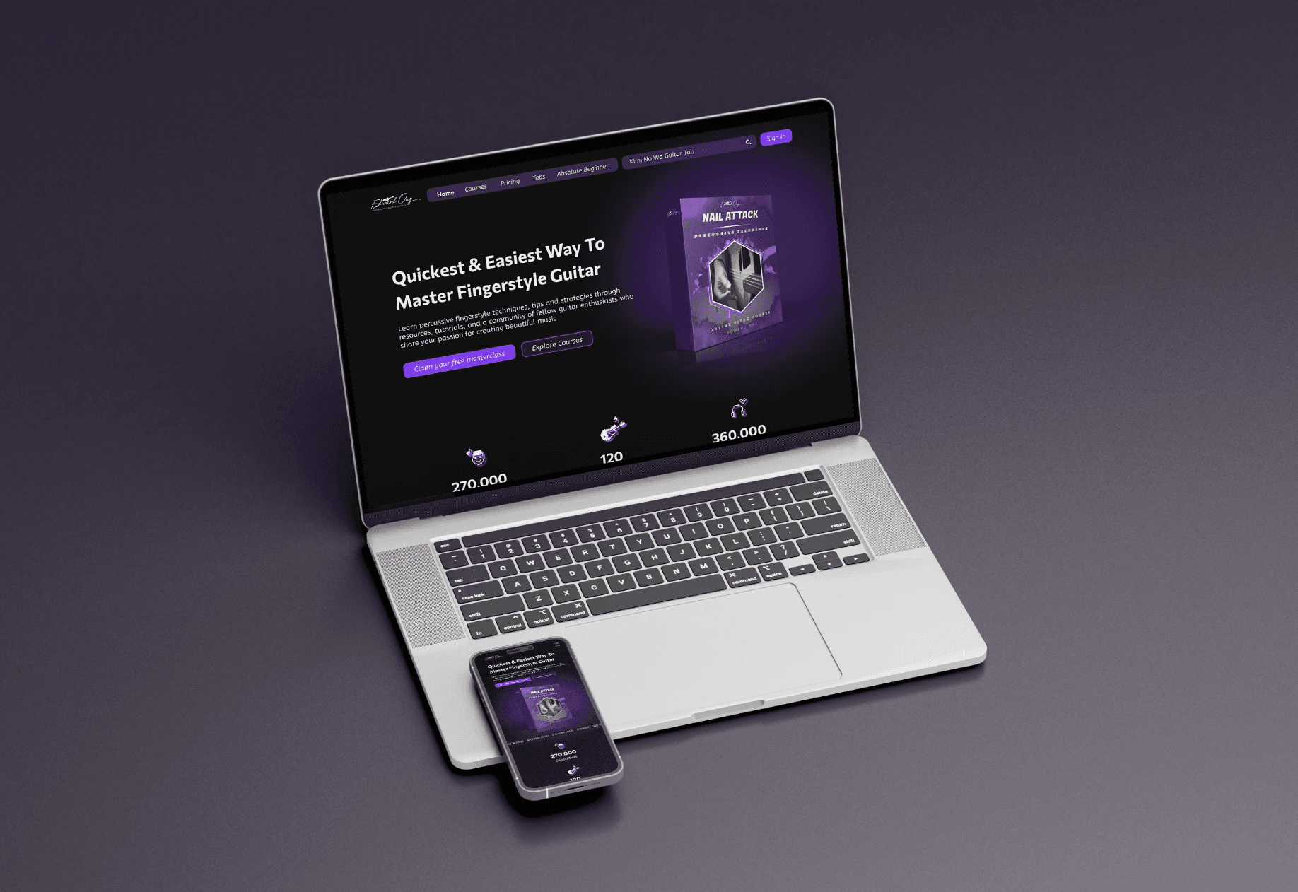
Edward Fingerstyle.

Edward Fingerstyle.

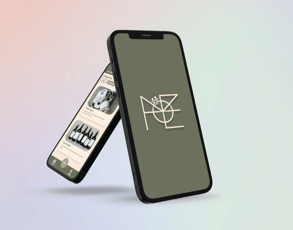
Locallift.

ux/ui case study

ux/ui case study

ux/ui case study

THE PRODUCT

THE PRODUCT

A website that offers fingerstyle guitar lessons, exercises, and instructional materials, along with related products like guitar tabs and guitars

A website that offers fingerstyle guitar lessons, exercises, and instructional materials, along with related products like guitar tabs and guitars

PROJECT DURATION

PROJECT DURATION

August 2023 - December 2023

August 2023 - December 2023

MY ROLE

MY ROLE

UX/UI designer, UX researcher

UX/UI designer, UX researcher

RESPONSIBILITIES

RESPONSIBILITIES

  • Conducted Literature Review And Competitive Analysis

  • Conducted user research

  • Defined the problem and provided insights to inform the ideation phase

  • Created personas, user journeys, empathy maps and user flows

  • Visual design of low-fi and high-fi wireframes, prototypes, and user testing

  • Developed the entire application from scratch

BACKGROUND

BACKGROUND

Chilled Music is a UK-based music label that represents several virtual artists on Spotify. They had the objective of rebranding one of their artists and giving a comprehensive redesign to the artist's website. This revamp included introducing additional features, notably online programs where the artist provides instruction on fingerstyle guitar techniques through video lessons and exercises. Additionally, their goal was to offer a range of products such as guitar tabs, guitars, and instructional materials to facilitate an accessible and effective journey to mastering fingerstyle guitar.


I was in the final stages of my master's degree, finalising my dissertation project, when I was assigned to this project. The startup company had a need for swift execution, in line with the typical pace of such ventures. Operating in an agile environment necessitated prompt results delivery and adaptability to evolving demands. 


I enthusiastically embraced this approach by swiftly refining design concepts and incorporating feedback. I followed a systematic approach to ensure that the end product effectively met both user needs and business requirements. Additionally, following the heuristic principles, I mainly priortisied flexibility and efficiency of use, consistency and standards, aesthetic and minamilsitic design.

THE PROBLEM

THE PROBLEM

The old site had unnecessary buttons and redundant links, causing confusion for users. Key pages were hidden or hard to find, multiple forms served the same purpose, the search bar was unresponsive, and the cart function was unclear on what items could be added.

THE GOAL

THE GOAL

The goal of the redesign is to streamline the user experience by removing redundant elements, improving navigation, enhancing search functionality, clarifying the cart system, and rebranding the artist to create a more cohesive and intuitive platform that better showcases their offerings

The goal of the redesign is to streamline the user experience by removing redundant elements, improving navigation, enhancing search functionality, clarifying the cart system, and rebranding the artist to create a more cohesive and intuitive platform that better showcases their offerings

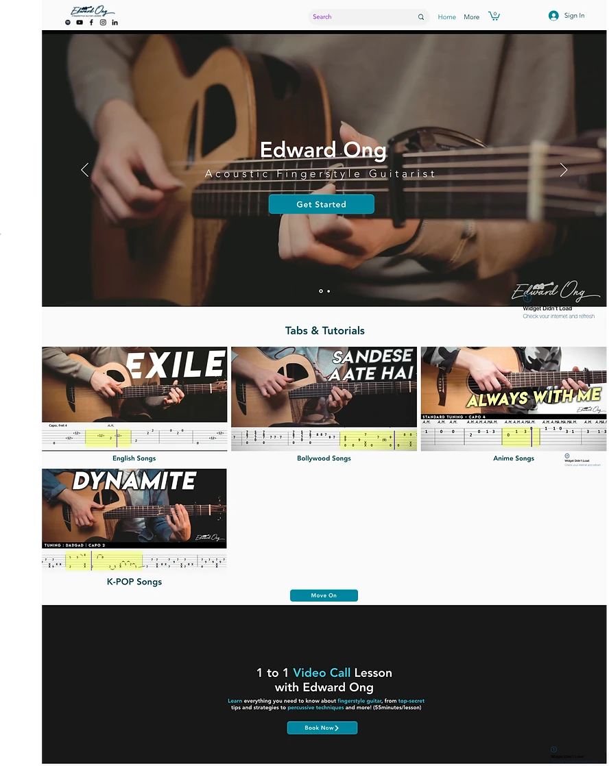
OLD SITE

OLD SITE

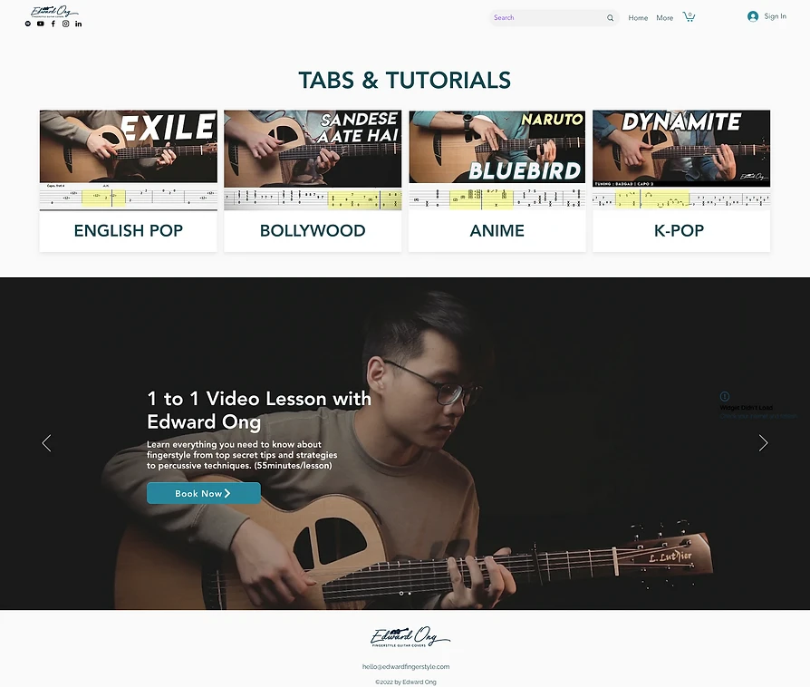
Before we dive into the design process, let's take a look at the old site first. We conducted a thorough analysis of the old site to identify the pain points users might be encountering. This evaluation provided valuable insights into areas that needed improvement, which became the foundation for the redesign and rebranding efforts aimed at enhancing user experience and streamlining navigation.

Before we dive into the design process, let's take a look at the old site first. We conducted a thorough analysis of the old site to identify the pain points users might be encountering. This evaluation provided valuable insights into areas that needed improvement, which became the foundation for the redesign and rebranding efforts aimed at enhancing user experience and streamlining navigation.

PAIN POINT 1

PAIN POINT 1

SOME BUTTONS ARE UNNECESSARY AS THEY JUST REPEATEDLY ANCHOR TO THE LATER SECTIONS OF THE WEBSITE

SOME BUTTONS ARE UNNECESSARY AS THEY JUST REPEATEDLY ANCHOR TO THE LATER SECTIONS OF THE WEBSITE

The design will include CTAs that provide clear directions to users about their destinations.

The design will include CTAs that provide clear directions to users about their destinations.

PAIN POINT 2

PAIN POINT 2

MOST SECTIONS LINK BACK TO THE SAME THING WHICH CAN BE CONFUSING TO USERS

MOST SECTIONS LINK BACK TO THE SAME THING WHICH CAN BE CONFUSING TO USERS

The design will have improved labeling and organisation which will make it easier for users to find what they are looking for without encountering repetitive links.

The design will have improved labeling and organisation which will make it easier for users to find what they are looking for without encountering repetitive links.

PAIN POINT 3

PAIN POINT 3

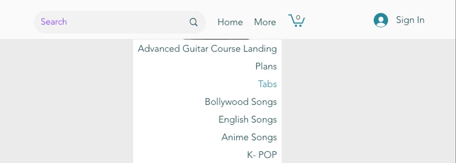
SOME INTERESTING PAGES CANNOT BE SEEN BY USERS, EVEN FROM THE NAVIGATION BAR

SOME INTERESTING PAGES CANNOT BE SEEN BY USERS, EVEN FROM THE NAVIGATION BAR

The design will introduce a more intuitive horizontal menu bar, making it easier for users to navigate across the site. The footer will also include additional links to pages that are not part of the main menu

The design will introduce a more intuitive horizontal menu bar, making it easier for users to navigate across the site. The footer will also include additional links to pages that are not part of the main menu

PAIN POINT 4

PAIN POINT 4

USERS STRUGGLE TO FIND THE DESIRED GUITER TABS AS THEY ARE ALL CLUTTERED IN A LIST FORMAT

The design will allow users to have the ability to sort, filter, or search through the extensive collection of guitar tab sheets offered by the artist.

The design will allow users to have the ability to sort, filter, or search through the extensive collection of guitar tab sheets offered by the artist.

PAIN POINT 5

PAIN POINT 5

The search bar is not responsive

The search bar is not responsive

The design will ensure that the website is responsive across different screen sizes

PAIN POINT 6

PAIN POINT 6

There's a cart but it's unclear what can be added to the cart 

There's a cart but it's unclear what can be added to the cart 

The design will include landing pages for every course, offering users comprehensive information beforecommitting to a purchase.

The design will include landing pages for every course, offering users comprehensive information beforecommitting to a purchase.

STARTING THE DESIGN

STARTING THE DESIGN

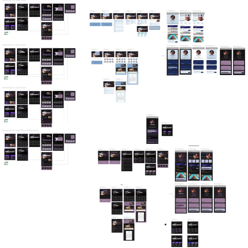
I focused on several key tasks to build a solid foundation for the app. I began by creating a sitemap to establish the overall structure and navigation flow. Next, I sketched paper wireframes to brainstorm and visualiSe initial design ideas, which then evolved into digital wireframes that refined the layout and functionality.


These wireframes were used to develop a low-fidelity prototype, allowing for early user interaction and feedback. Finally, I conducted usability studiesto test and gather insights, ensuring the design met user needs and expectations

SITEMAP

SITEMAP

SITEMAP

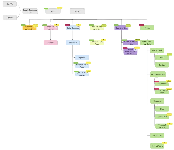
To guarantee comprehensive coverage of all requirements and features, I generated the following sitemap in Miro for presentation to the stakeholders. Given the project's early stage, it's understood by the stakeholders that modifications to the sitemap may be necessary as the project unfolds. 


The coloured bubbles in the corners of each page serve as visual cues for the statuses of those pages, making it more convenient for stakeholders to grasp the current project statuses. These indicators denote whether a page is pending, finalised, or set for discussion, simplifying the tracking of progress.

WIREFRAMES

WIREFRAMES

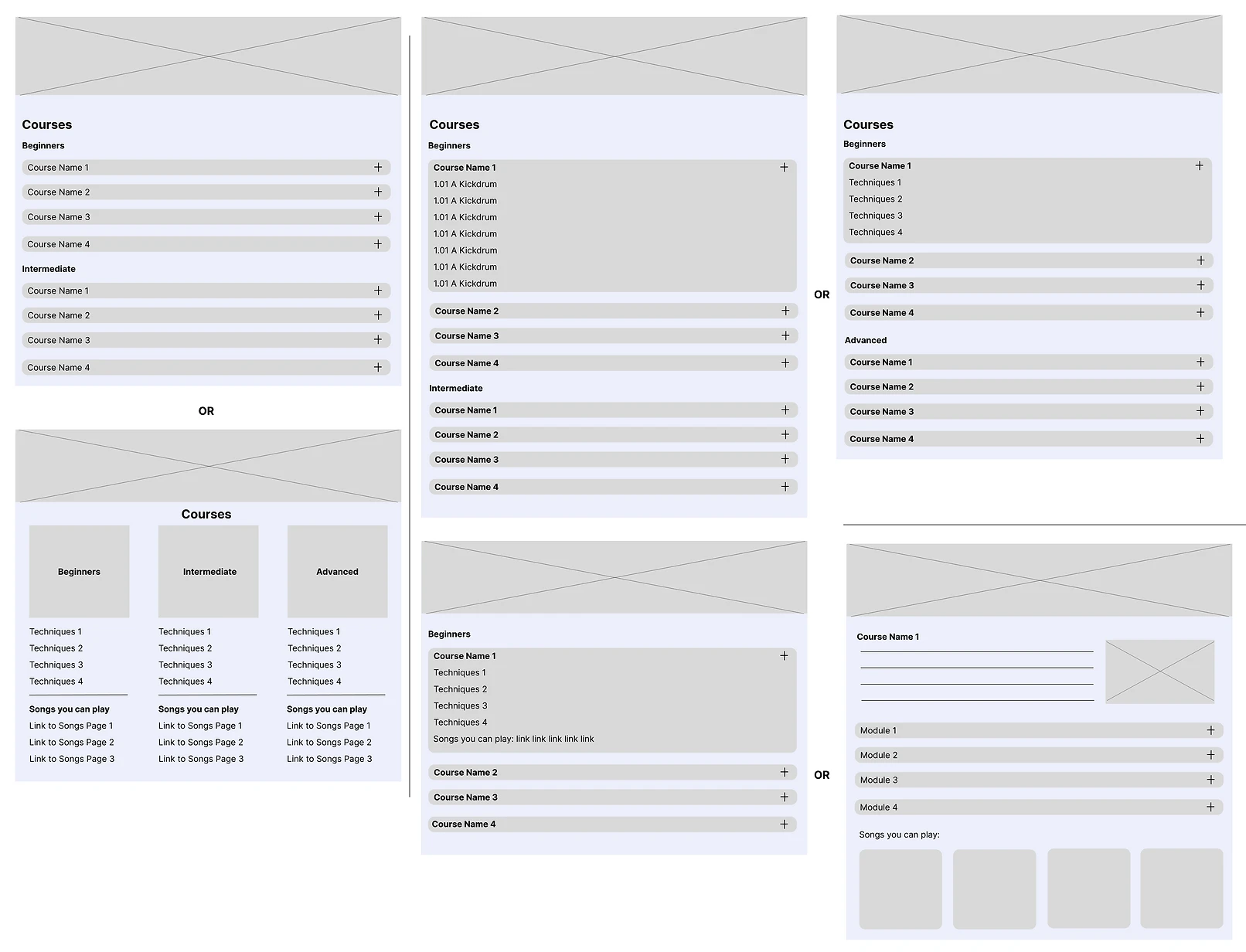
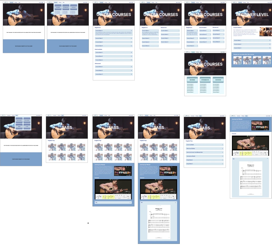
We kept the limitations of WIX strongly in mind while creating the following wireframes, which were developed based on insights gathered from research and client meetings. These wireframes and mockups are designed to align with the capabilities and constraints of the WIX platform, ensuring a practical and achievable implementation.

We kept the limitations of WIX strongly in mind while creating the following wireframes, which were developed based on insights gathered from research and client meetings. These wireframes and mockups are designed to align with the capabilities and constraints of the WIX platform, ensuring a practical and achievable implementation.

REBRRANDING COLOURS AND THEME

REBRRANDING COLOURS AND THEME

REBRRANDING COLOURS AND THEME

We underwent multiple iterations to arrive at the branding colours and the overall theme for the website. Ultimately, we settled on a neon purple theme. This choice was driven by our predominantly male audience, their interest in anime, and our desire to evoke a sense of nostalgia and retro aesthetics. Additionally, the artist's primary focus on Anime OSTs covers played a role in shaping this decision.

We underwent multiple iterations to arrive at the branding colours and the overall theme for the website. Ultimately, we settled on a neon purple theme. This choice was driven by our predominantly male audience, their interest in anime, and our desire to evoke a sense of nostalgia and retro aesthetics. Additionally, the artist's primary focus on Anime OSTs covers played a role in shaping this decision.

We underwent multiple iterations to arrive at the branding colours and the overall theme for the website. Ultimately, we settled on a neon purple theme. This choice was driven by our predominantly male audience, their interest in anime, and our desire to evoke a sense of nostalgia and retro aesthetics. Additionally, the artist's primary focus on Anime OSTs covers played a role in shaping this decision.

USABILITY STUDY

USABILITY STUDY

STUDY TYPE

Unmoderated Usability Study

Unmoderated Usability Study

LOCATION

Sheffield, United Kingdom (In-Person)

Sheffield, United Kingdom (In-Person)

PARTICIPANTS

5 Participants

5 Participants

LENGTH

10 - 15 Minutes

FINDING 1

Users expressed that the hero section does not seem professional and trustworthy as a skilled guitarist

Users expressed that the hero section does not seem professional and trustworthy as a skilled guitarist

FINDING 2

The website is fully responsive, adapting to various screen sizes and devices, while maintaining accessibility across mobile, tablet, and desktop for all users.

The website is fully responsive, adapting to various screen sizes and devices, while maintaining accessibility across mobile, tablet, and desktop for all users.

FINDING 3

A high-contrast colour palette is implemented to improve readability for users with visual impairments, particularly for text and important elements like buttons or links.

A high-contrast colour palette is implemented to improve readability for users with visual impairments, particularly for text and important elements like buttons or links.

REFINING THE DESIGN

REFINING THE DESIGN

Following the usability study, I focused on refining the design to address user feedback and enhance overall usability. I developed mockups to improve the visual design and incorporate any changes identified during testing.


These mockups were then transformed into a high-fidelity prototype, offering a more polished and interactive version of the app for further evaluation. Additionally, I made sure to prioritiSe accessibility throughout the design process, ensuring the app is inclusive and usable for a diverse range of users.

MOCKUPS: BEFORE AND AFTER USABILITY STUDY

MOCKUPS: BEFORE AND AFTER USABILITY STUDY

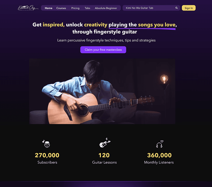
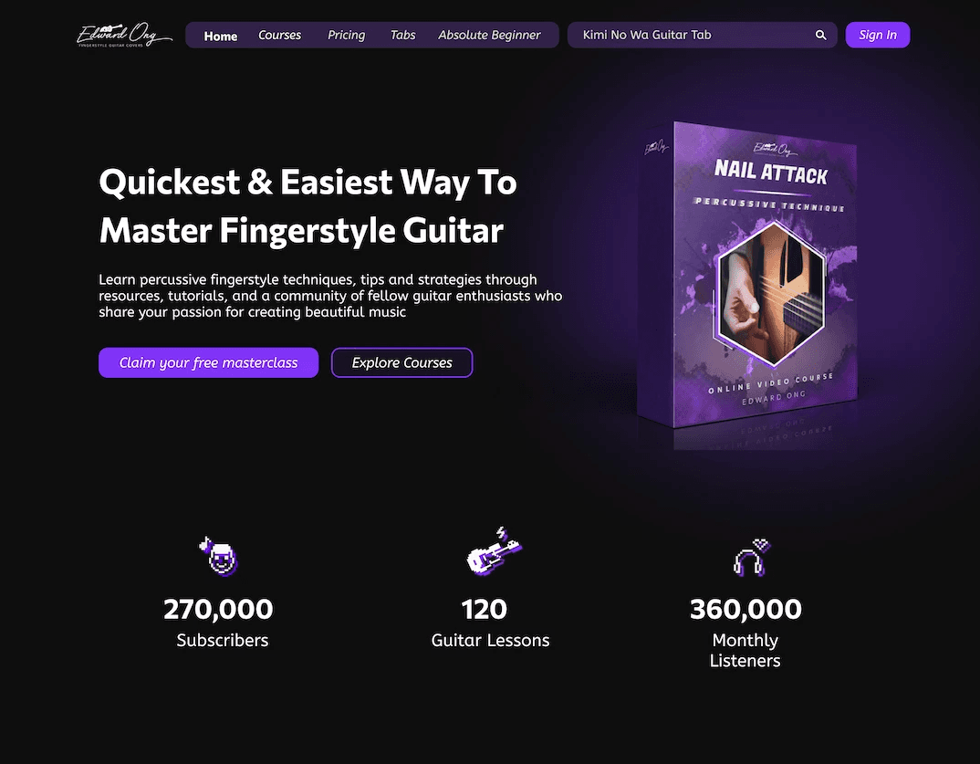
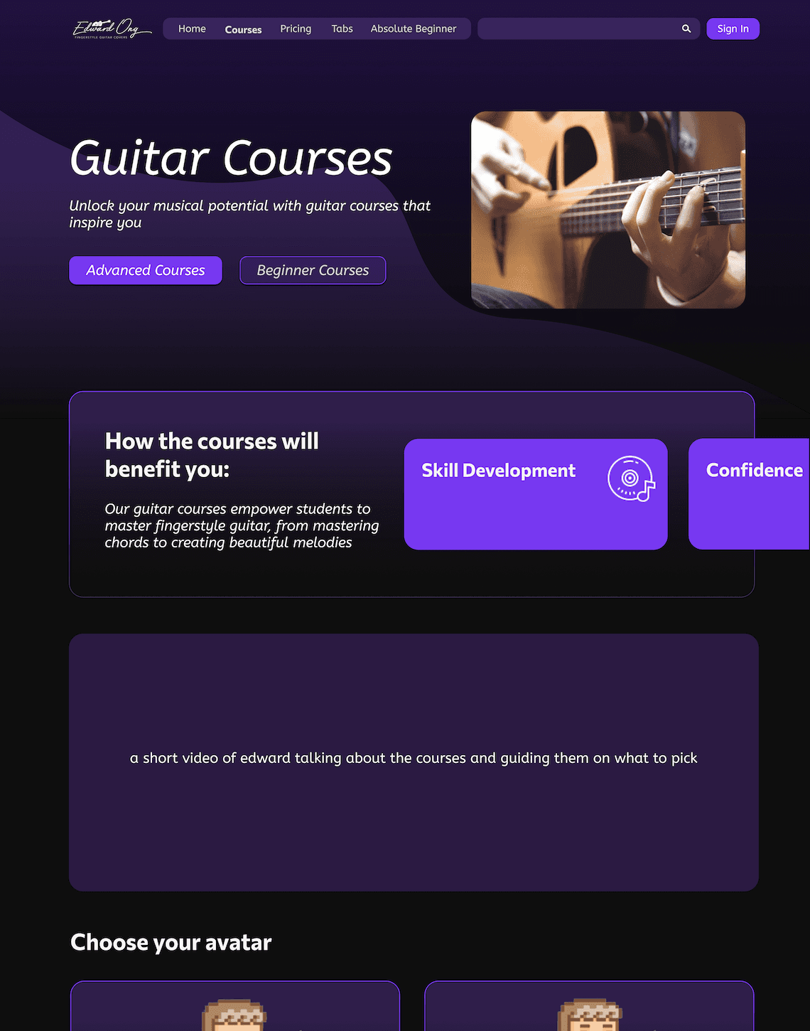
The hero section was polished to achieve a more professional appearance. To highlight the artist's services and products effectively, I incorporated them directly into this section, ensuring users are immediately aware of what he has to offer. Additionally, we reduced the coluor palette from three to two main colours, creating a cleaner and more cohesive look.

The hero section was polished to achieve a more professional appearance. To highlight the artist's services and products effectively, I incorporated them directly into this section, ensuring users are immediately aware of what he has to offer. Additionally, we reduced the coluor palette from three to two main colours, creating a cleaner and more cohesive look.

BEFORE

BEFORE

AFTER

AFTER

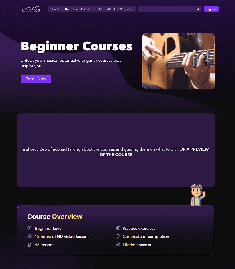
Users expressed their dissatisfaction with the horizontal scrolling section designed to showcase course benefits, prompting us to remove it. In its place, we introduced a comprehensive course overview section, allowing users to easily access and understand the information they need.

Users expressed their dissatisfaction with the horizontal scrolling section designed to showcase course benefits, prompting us to remove it. In its place, we introduced a comprehensive course overview section, allowing users to easily access and understand the information they need.

BEFORE

BEFORE

AFTER

AFTER

FINAL

FINAL

MOCKUP DESIGNS

MOCKUP DESIGNS

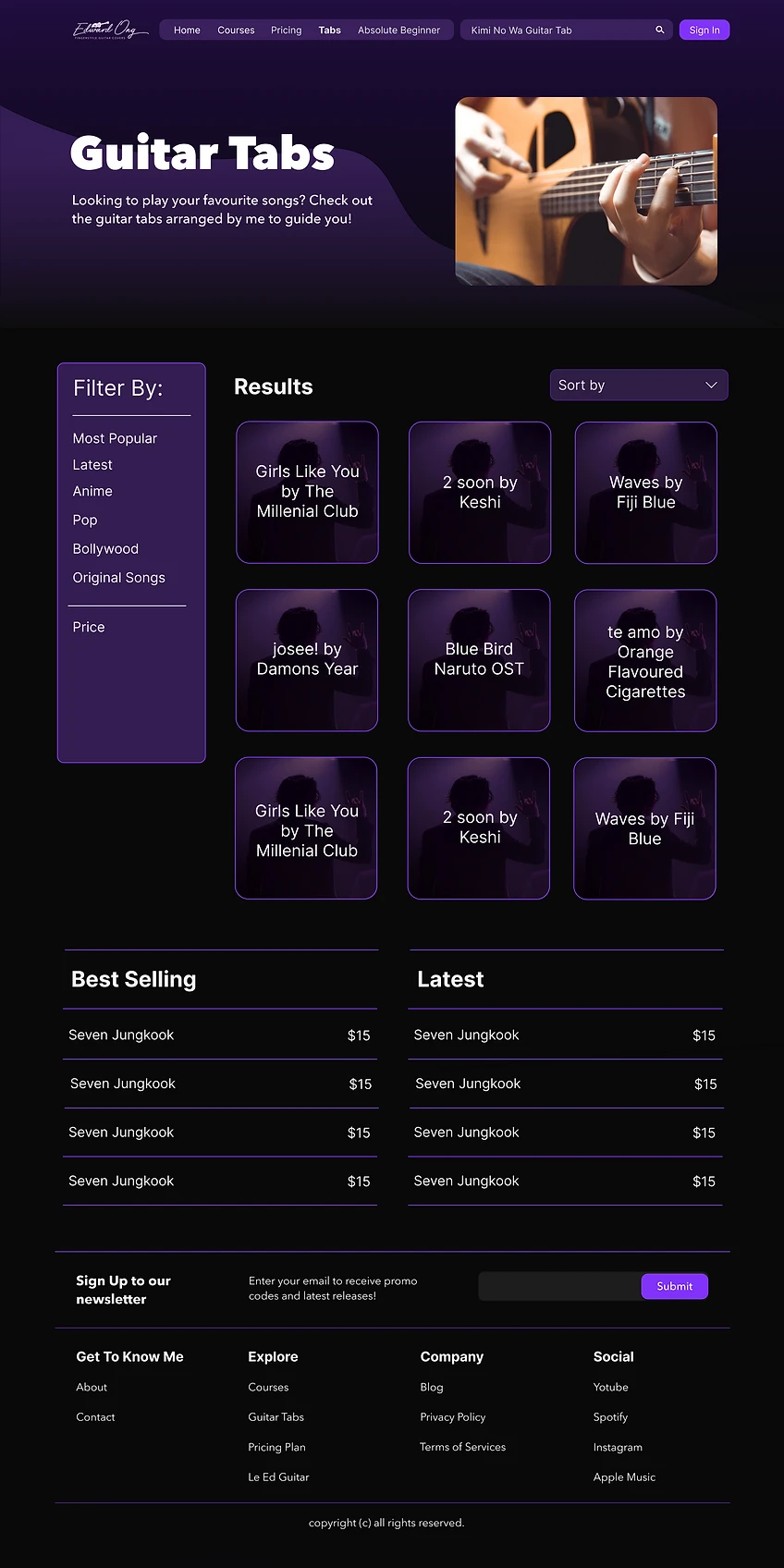
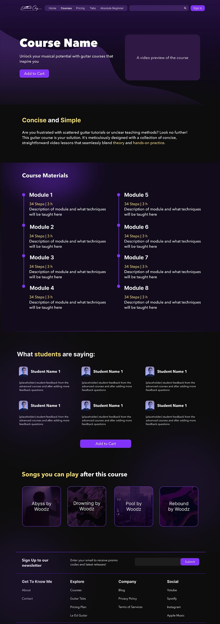
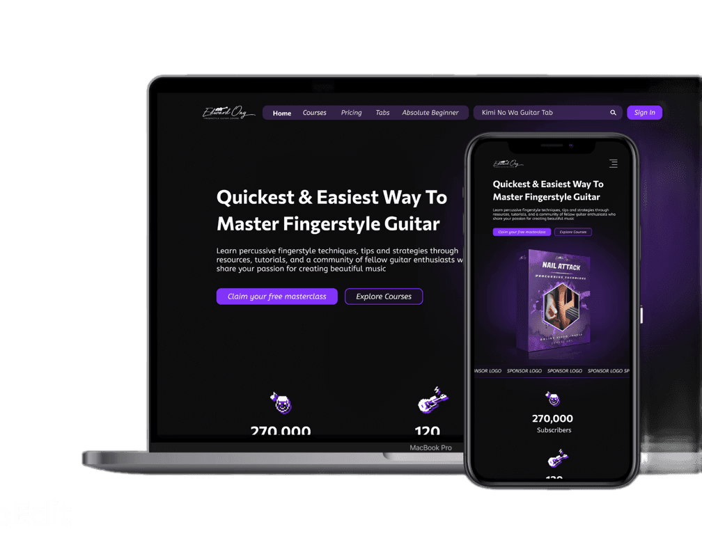
Once the theme was finalised, high-fidelity mockups were created to ensure that the final deliverable was as precise as possible. This process helped identify any unexpected constraints or issues before the actual implementation in WIX. 


The original website faced significant challenges related to navigation, design, and the CTA Buttons (Call to Action) leading to the same pages. 

  • In the redesigned website, we have introduced a more intuitive horizontal menu bar, making it easier for users to navigate across the site. 

  • The footer now includes additional links to pages that are not part of the main menu, enhancing the overall user experience.

  • The CTAs have been refined to provide clear directions to users about their destinations. 

  • To improve the artist's reputation, social proof has been incorporated into the homepage, which the previous website didn't have. 


In the past, all guitar tabs were presented in a cluttered list format. 

  • Now, users have the ability to sort, filter, or search through the extensive collection of guitar tab sheetsoffered by the artist. 


Previously, the website lacked dedicated landing pages for various components. 

  • We have introduced landing pages for both guitar tabs and courses, replacing the practice of directing users to external platforms. 


Typically, users would receive an email after purchasing a course, guiding them to another learning platform. 

  • This redesign includes landing pages for every course, offering users comprehensive information beforecommitting to a purchase.

  • Additionally, all courses are now hosted on the same website, simplifying access to all content. 

  • This integration also provides the artist with improved capabilities for analysing customer behaviour.

ACCESSIBILITY CONSIDERATIONS

ACCESSIBILITY CONSIDERATIONS

1

Clear, concise, and consistent navigation labels to reduce cognitive load and make it easier for users to locate different sections or resources without confusion.

Clear, concise, and consistent navigation labels to reduce cognitive load and make it easier for users to locate different sections or resources without confusion.

2

The website is fully responsive, adapting to various screen sizes and devices, while maintaining accessibility across mobile, tablet, and desktop for all users.

The website is fully responsive, adapting to various screen sizes and devices, while maintaining accessibility across mobile, tablet, and desktop for all users.

3

A high-contrast colour palette is implemented to improve readability for users with visual impairments, particularly for text and important elements like buttons or links.

A high-contrast colour palette is implemented to improve readability for users with visual impairments, particularly for text and important elements like buttons or links.

GOING FORWARD

IMPACT

IMPACT

The redesign was a success, aligning perfectly with both the business goals and user needs. The artist has received positive feedback from users, who have expressed their appreciation for the intuitive layout and how easy it is to navigate and find content related to guitar lessons and tabs. This has strengthened the connection between the artist and his audience, enhancing the overall user experience.

The redesign was a success, aligning perfectly with both the business goals and user needs. The artist has received positive feedback from users, who have expressed their appreciation for the intuitive layout and how easy it is to navigate and find content related to guitar lessons and tabs. This has strengthened the connection between the artist and his audience, enhancing the overall user experience.

HOW I FEEL TOWARDS THIS PROJECT

HOW I FEEL TOWARDS THIS PROJECT

I feel a strong sense of pride regarding this project, as it achieved success despite numerous limitations. Conducting a thorough analysis of the old site while monitoring new web analytics to understand user behavior was crucial. Although it was unfortunate that we couldn't conduct proper user research before the design phase due to constraints, the positive feedback from both old and new users, along with the increase in product sales, demonstrates the effectiveness of our redesign.

I feel a strong sense of pride regarding this project, as it achieved success despite numerous limitations. Conducting a thorough analysis of the old site while monitoring new web analytics to understand user behavior was crucial. Although it was unfortunate that we couldn't conduct proper user research before the design phase due to constraints, the positive feedback from both old and new users, along with the increase in product sales, demonstrates the effectiveness of our redesign.

WHAT WOULD I HAVE DONE DIFFERENTLY?

WHAT WOULD I HAVE DONE DIFFERENTLY?

If given the opportunity, I would have prioritised conducting comprehensive user research before the redesign to gather insights directly from our target audience. This would have provided us with a deeper understanding of their needs and preferences, allowing us to tailor the design more effectively. Additionally, I would have allocated more time to user testing during the design process to gather real-time feedback and make necessary adjustments
SEE OTHER PROJECTS

SEE OTHER PROJECTS

LOCALLIFT

Where community meets collaboration

Read More

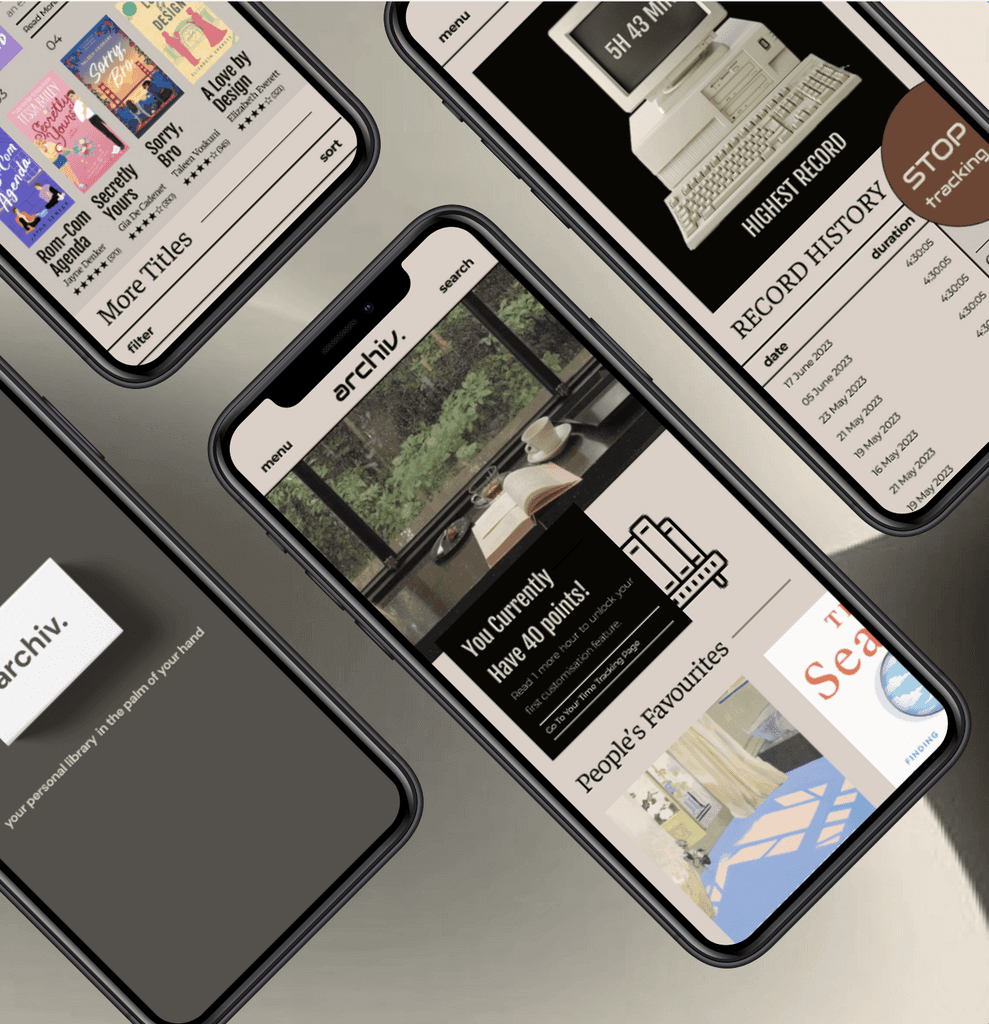
ARCHIV.

Your personal library in your hand

Read More

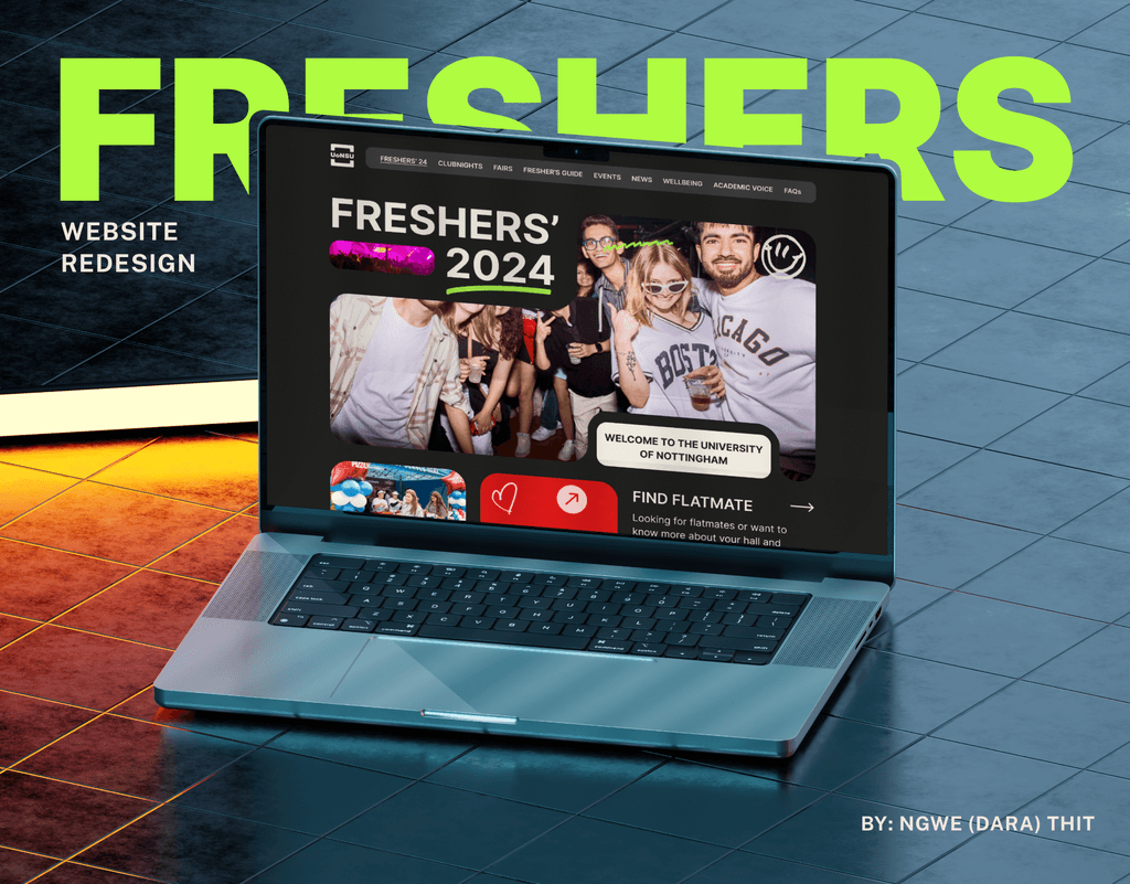
FRESHERS'

Without you, there's no SU

Read More