WHERE COMMUNITY MEETS COMPASSION
WHERE COMMUNITY MEETS COMPASSION
Locallift.
Locallift.
Locallift.
ux/ui case study
ux/ui case study
ux/ui case study
THE PRODUCT
THE PRODUCT
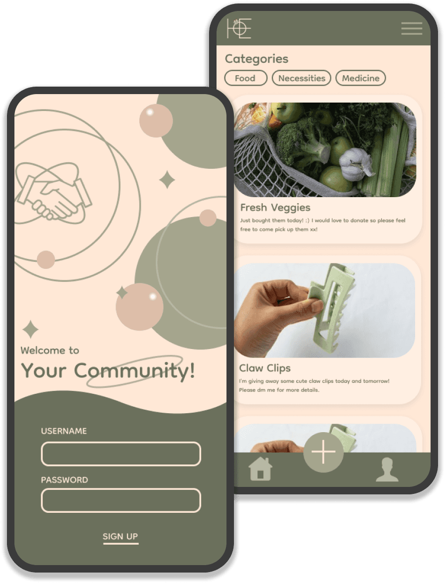
A mobile app that helps communities to collaborate and help each other during times of crisis such as Covid-19
A mobile app that helps communities to collaborate and help each other during times of crisis such as Covid-19
PROJECT DURATION
PROJECT DURATION
August 2024 - October 2024
August 2024 - October 2024
MY ROLE
MY ROLE
UX/UI designer, UX researcher
UX/UI designer, UX researcher
RESPONSIBILITIES
RESPONSIBILITIES
Conducted Literature Review And Competitive Analysis
Conducted user research
Defined the problem and provided insights to inform the ideation phase
Created personas, user journeys, empathy maps and user flows
Visual design of low-fi and high-fi wireframes, prototypes, and user testing
Developed the entire application from scratch


BACKGROUND
BACKGROUND
The COVID-19 pandemic has greatly affected daily lives and led to extreme consumer behavior and panic buying. As a consequence, daily necessities, food and other resources ran out. World Health Organisation [WHO] suggested that in order to contain this virus, communities need to coordinate together. Even just small benefitting actions in individual communities can benefit the whole world.
Community resilience is a term used to describe the ability of communities to cope together to recover from large-scale emergencies. This means communities coordinating to strengthen factors such as social networks which will support people in times of crisis. This is proven by the Committee for Community Engagement which was established by CDC in 1995 and the community engagement during the AIDS epidemic
THE PROBLEM
THE PROBLEM
Crises like COVID-19 have profoundly disrupted daily life, triggering extreme consumer behaviour and widespread panic buying. This surge in demand led to shortages of necessities, food and other vital resources, leaving many communities struggling to meet their basic needs
Crises like COVID-19 have profoundly disrupted daily life, triggering extreme consumer behaviour and widespread panic buying. This surge in demand led to shortages of necessities, food and other vital resources, leaving many communities struggling to meet their basic needs
THE GOAL
THE GOAL
An app that empowers individuals to buy, sell, exchange, or donate resources within their local community using location-based technology. By connecting people when essential goods are unavailable in stores, it fosters collaboration and mutual support among the community.
An app that empowers individuals to buy, sell, exchange, or donate resources within their local community using location-based technology. By connecting people when essential goods are unavailable in stores, it fosters collaboration and mutual support among the community.
UNDERSTANDING THE USER
UNDERSTANDING THE USER
To understand user frustration, needs, and requirements, I conducted user research through a user survey for my project. My goal was to gain insights into the needs and wants of users, surrounding their experiences with shopping during times of crisis so that I can better design my app and responsive website.
There are two types of user research methodologies: qualitative and quantitative research. I chose quantitative research because I had a time constraint. Since online surveys are a faster method of data collection from a large number of participants, this allows me to gain accurate and efficient results.
PAIN POINT 1
PAIN POINT 1
Delays in accessing essential items due to stock shortages
Delays in accessing essential items due to stock shortages
The design will guide to include real-time inventory, ensuring users can quickly find available resources nearby and avoid long delays.
The design will guide to include real-time inventory, ensuring users can quickly find available resources nearby and avoid long delays.
PAIN POINT 2
PAIN POINT 2
(Isolated) Individuals had to rely on others or delivery
(Isolated) Individuals had to rely on others or delivery
The design will focus on easy-to-use location-based support features, allowing users to request help from the local community in an efficient way.
The design will focus on easy-to-use location-based support features, allowing users to request help from the local community in an efficient way.
PAIN POINT 3
PAIN POINT 3
Uncertainty about seller’s trustworthiness
Uncertainty about seller’s trustworthiness
To address this, the design will include a review system, allowing users to evaluate the credibility of sellers. This feature will build a sense of trust within the community.
To address this, the design will include a review system, allowing users to evaluate the credibility of sellers. This feature will build a sense of trust within the community.
PAIN POINT 4
PAIN POINT 4
In-stock items are often overpriced
In-stock items are often overpriced
The design will include community-driven price moderation to prevent price gouging and ensure fair access to essential resources for all users.
The design will include community-driven price moderation to prevent price gouging and ensure fair access to essential resources for all users.
USER PERSONA 1
USER PERSONA 1
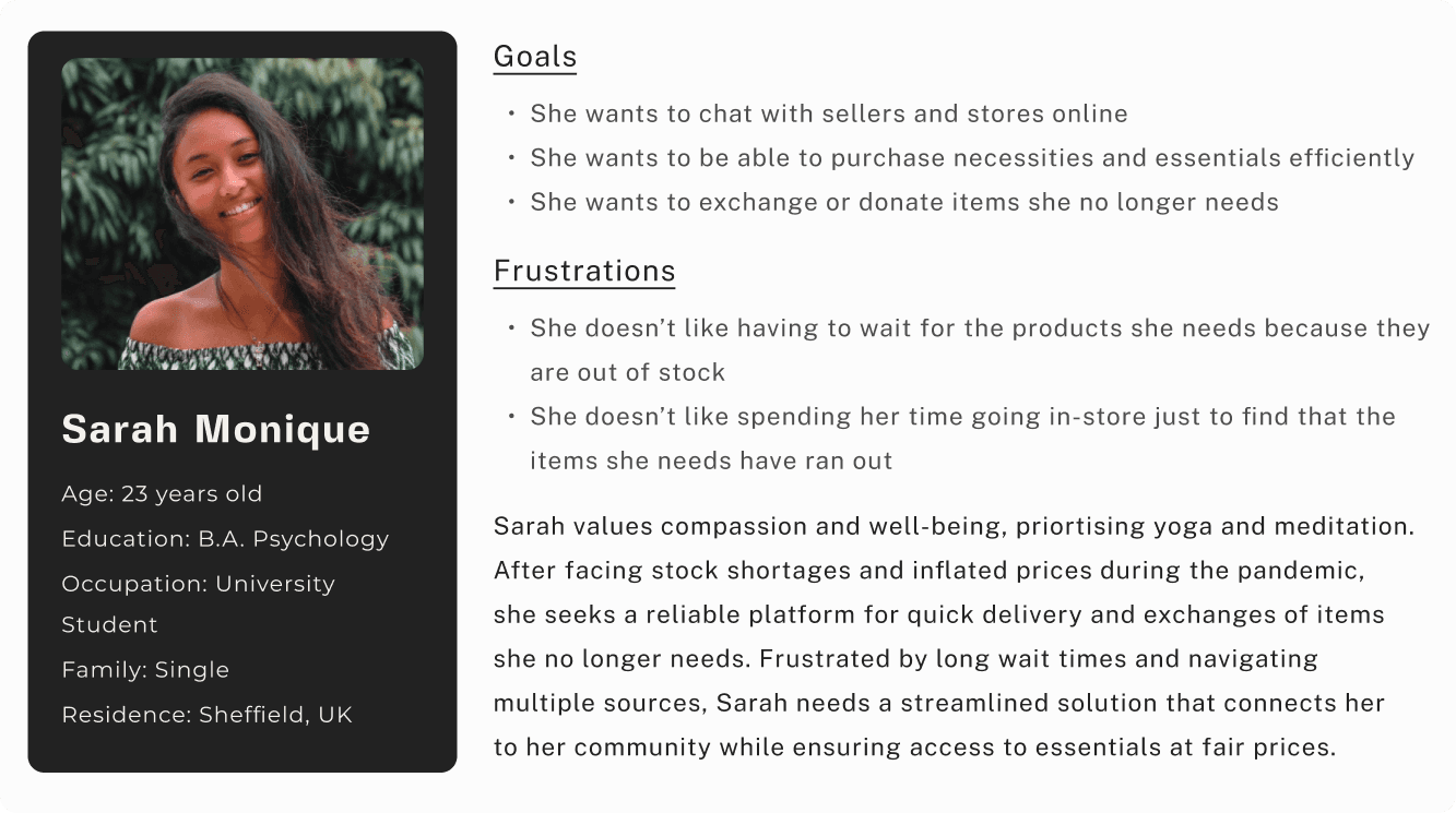
Problem Statement: Sarah needs a fast and reliable way to access essential items and exchange items she no longer needs, as she is frustrated by stock shortages and inflated prices in stores.
Problem Statement: Sarah needs a fast and reliable way to access essential items and exchange items she no longer needs, as she is frustrated by stock shortages and inflated prices in stores.


USER PERSONA 2
USER PERSONA 2
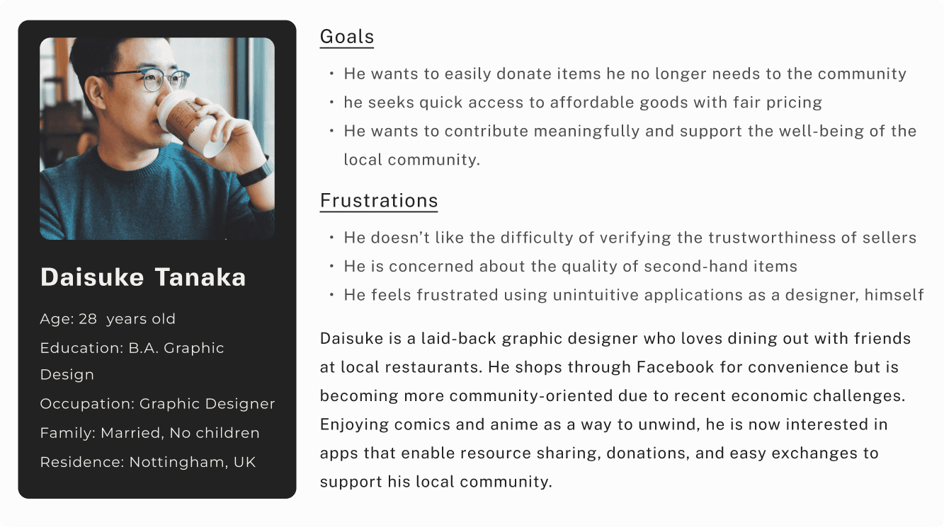
Problem Statement: Daisuke needs a reliable shopping platform that provides good quality products with clear product details and pricing. Frustrated by unclear seller trustworthiness, he seeks a more transparent and efficient shopping experience that allow him to donate to others
Problem Statement: Daisuke needs a reliable shopping platform that provides good quality products with clear product details and pricing. Frustrated by unclear seller trustworthiness, he seeks a more transparent and efficient shopping experience that allow him to donate to others


USER JOURNEY MAP
USER JOURNEY MAP
USER JOURNEY MAP
Goal: To trade her unwanted items for something more useful, creating a mutually beneficial exchange with others in the community.
Goal: To trade her unwanted items for something more useful, creating a mutually beneficial exchange with others in the community.
Goal: To trade her unwanted items for something more useful, creating a mutually beneficial exchange with others in the community.
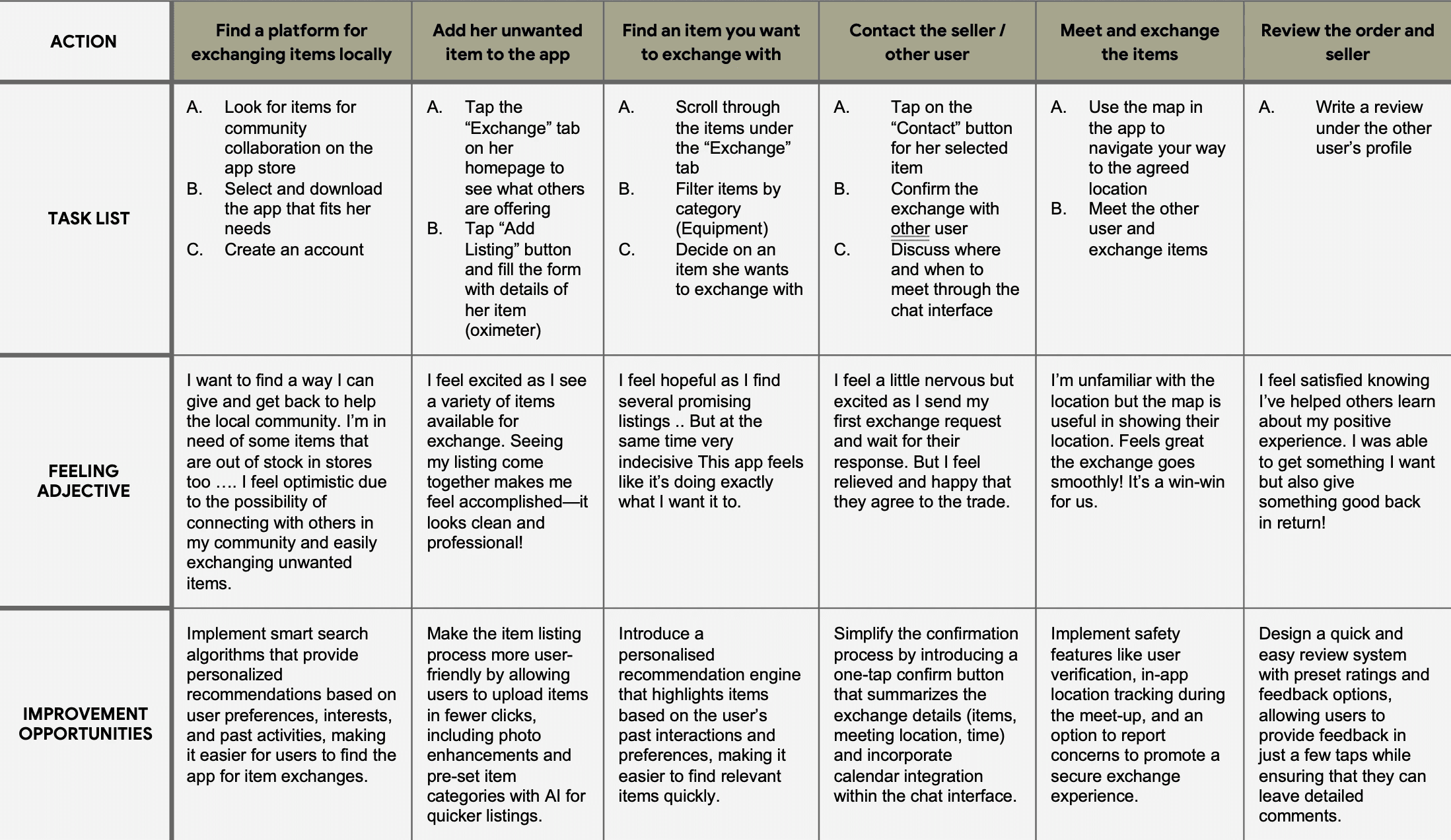


I created user journey map to illustrate Sarah’s actions, feelings, and thoughts as she exchanges items, intending to identify pain points and create opportunities for positive experiences.
I created user journey map to illustrate Sarah’s actions, feelings, and thoughts as she exchanges items, intending to identify pain points and create opportunities for positive experiences.
I created user journey map to illustrate Sarah’s actions, feelings, and thoughts as she exchanges items, intending to identify pain points and create opportunities for positive experiences.
STARTING THE DESIGN
STARTING THE DESIGN
I focused on several key tasks to build a solid foundation for the app. I began by creating a sitemap to establish the overall structure and navigation flow. Next, I sketched paper wireframes to brainstorm and visualiSe initial design ideas, which then evolved into digital wireframes that refined the layout and functionality.
These wireframes were used to develop a low-fidelity prototype, allowing for early user interaction and feedback. Finally, I conducted usability studiesto test and gather insights, ensuring the design met user needs and expectations
SITEMAP
SITEMAP
SITEMAP
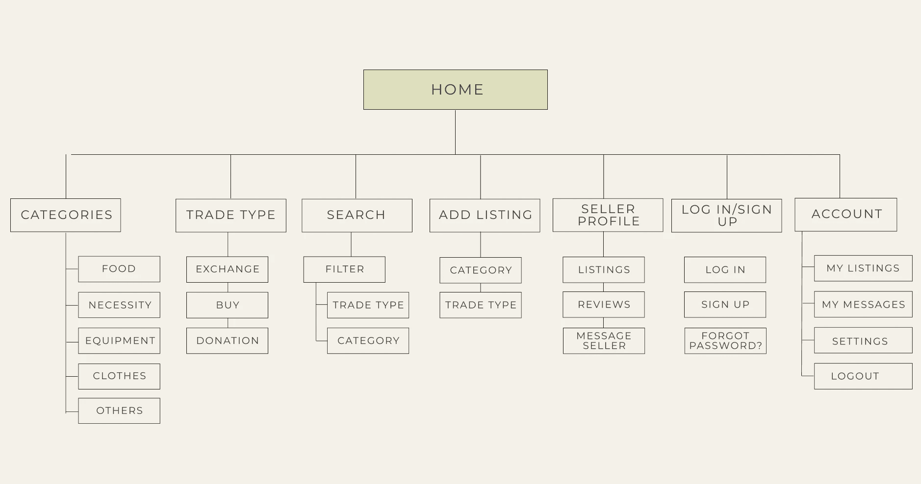
I built a sitemap to better visualise the clear content hierarchy, enhanced navigation and SEO. It also allowed me to further identify gaps in meeting users’ needs.
I built a sitemap to better visualise the clear content hierarchy, enhanced navigation and SEO. It also allowed me to further identify gaps in meeting users’ needs.
I built a sitemap to better visualise the clear content hierarchy, enhanced navigation and SEO. It also allowed me to further identify gaps in meeting users’ needs.


PAPER WIREFRAMES
PAPER WIREFRAMES
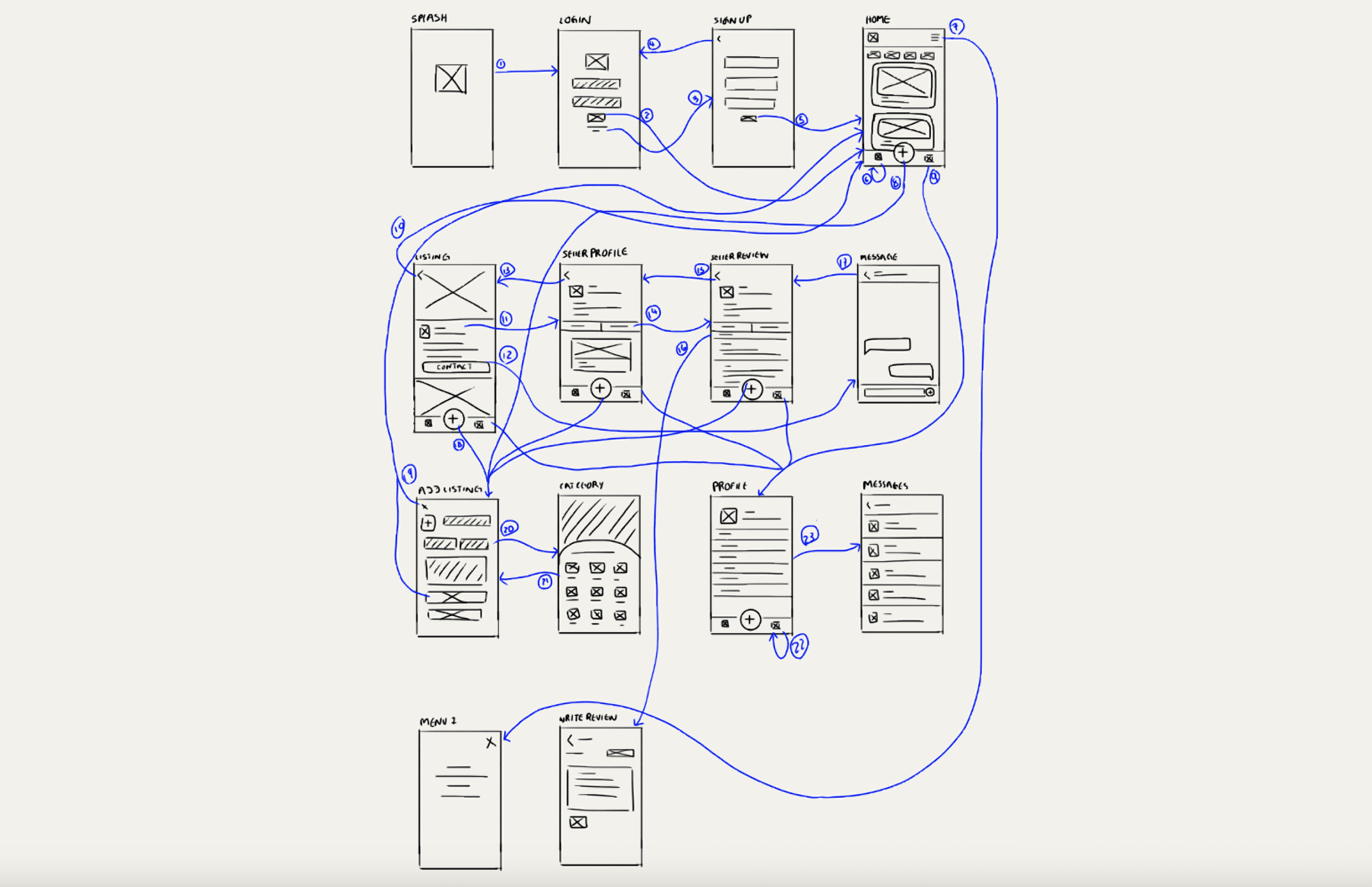
I focused on the main priorities and insights I gained from the user research. Instead of using paper and pencil, I opted to use my I-pad to sketch the wireframes.
I focused on the main priorities and insights I gained from the user research. Instead of using paper and pencil, I opted to use my I-pad to sketch the wireframes.


DIGITAL WIREFRAMES
DIGITAL WIREFRAMES
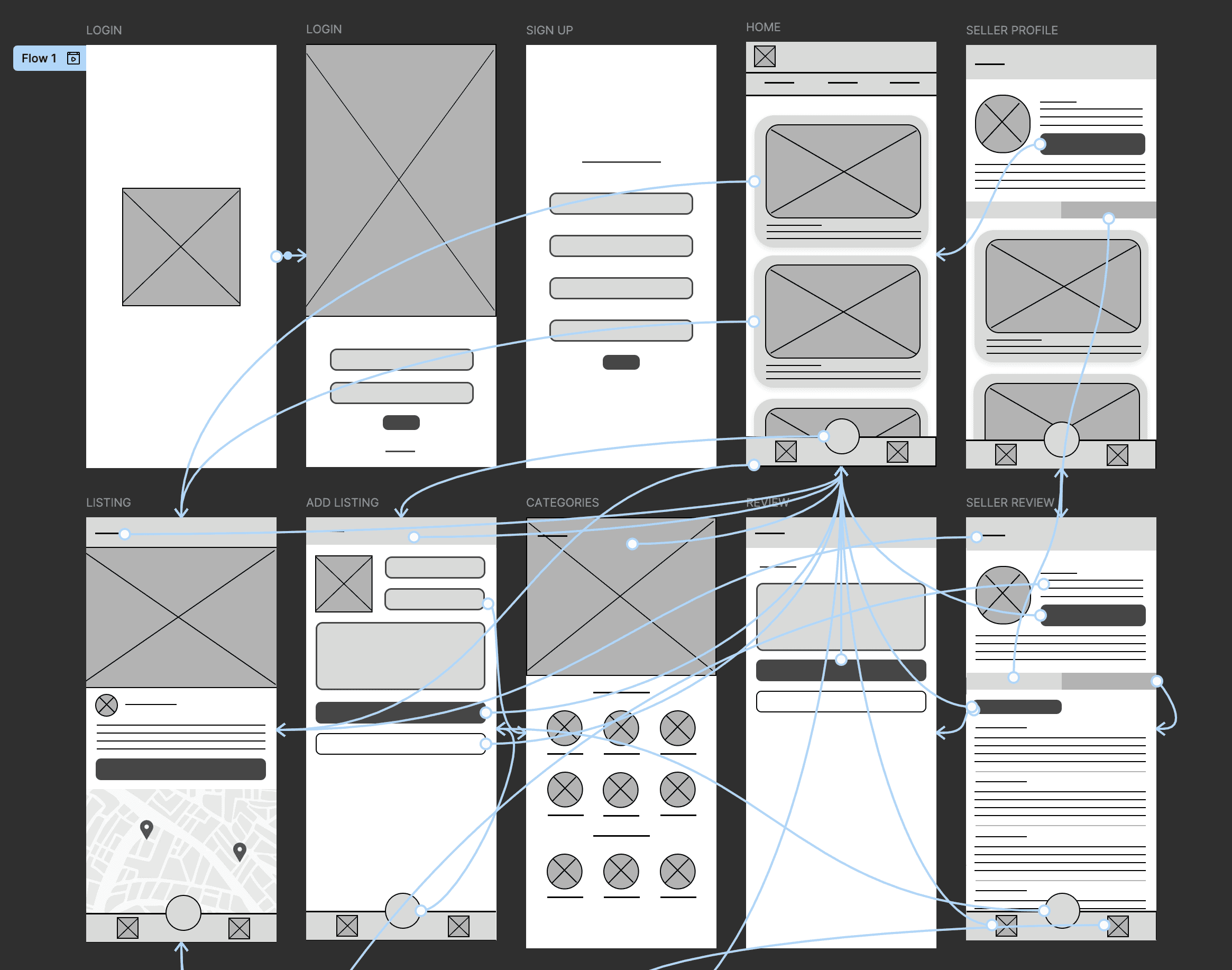
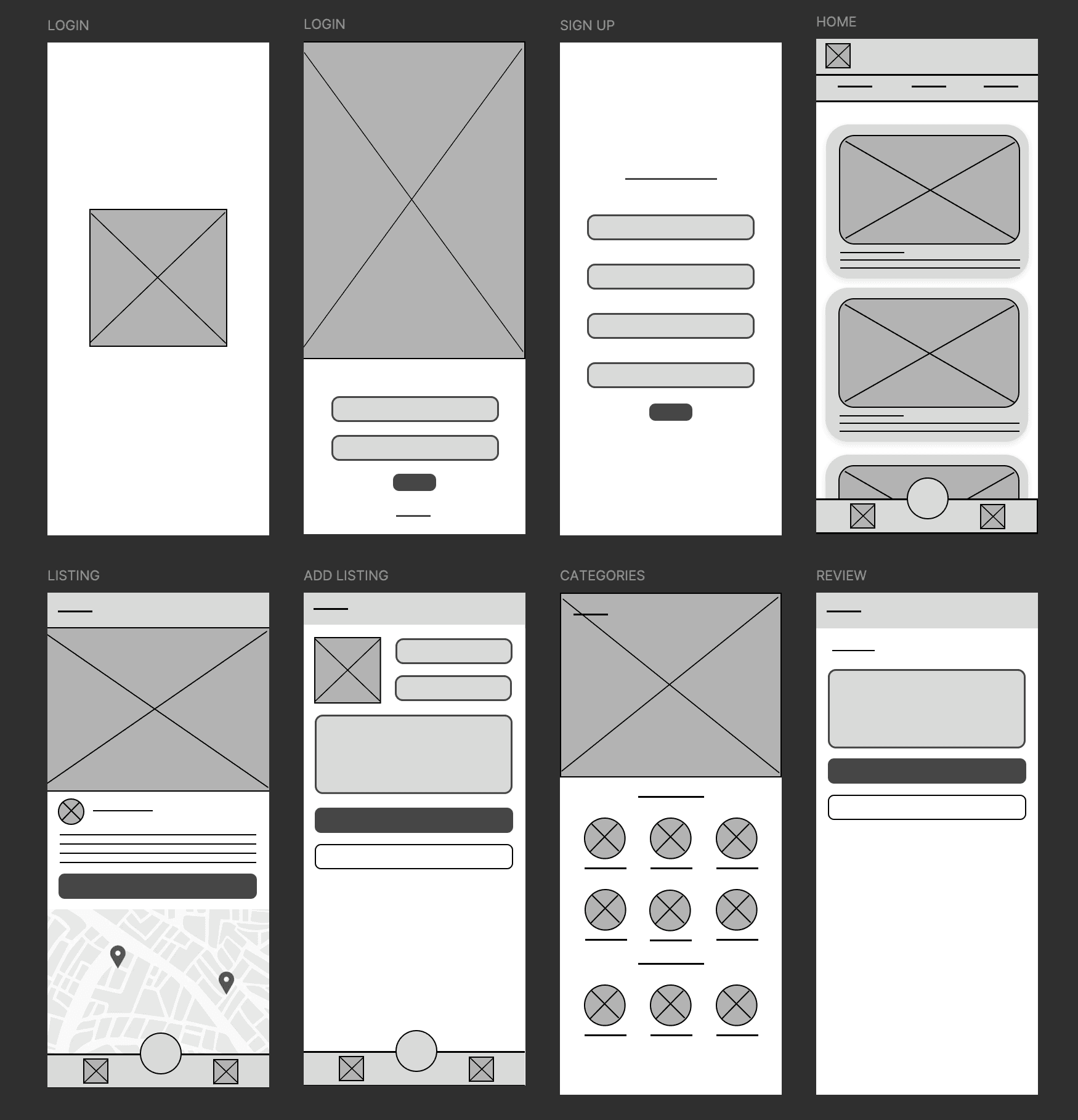
The primary goal was to create a simple and intuitive user interface that enhances the overall user journey. By priortising clarity and ease of use, the design aims for an efficient navigation to ensure that users can quickly access and complete their tasks.
The primary goal was to create a simple and intuitive user interface that enhances the overall user journey. By priortising clarity and ease of use, the design aims for an efficient navigation to ensure that users can quickly access and complete their tasks.


DIGITAL WIREFRAMES: SCREEN SIZE VARIATION(S)
DIGITAL WIREFRAMES: SCREEN SIZE VARIATION(S)
DIGITAL WIREFRAMES: SCREEN SIZE VARIATION(S)
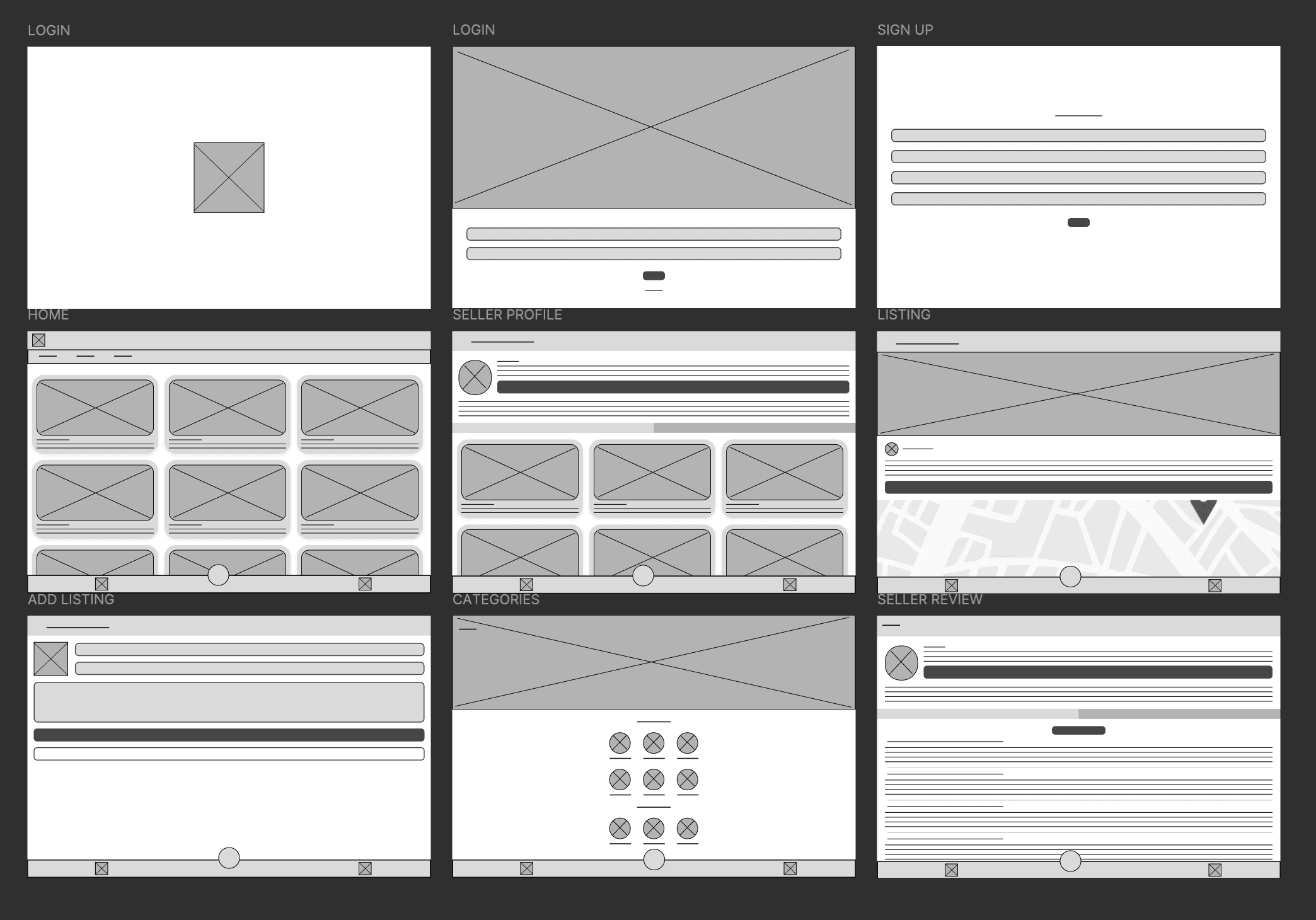
I also started to work on digital wireframes for additional screen sizes to make sure the site would be fully responsive. This is for a desktop screen.
I also started to work on digital wireframes for additional screen sizes to make sure the site would be fully responsive. This is for a desktop screen.
I also started to work on digital wireframes for additional screen sizes to make sure the site would be fully responsive. This is for a desktop screen.


LOW-FIDELITY PROTOTYPE
LOW-FIDELITY PROTOTYPE
LOW-FIDELITY PROTOTYPE
I first created a low-fidelity prototype from the user flow diagram and wireframes to test functionality. The user flow illustrated in this prototype shows every essential screen that guides users through their journey within their app.
I first created a low-fidelity prototype from the user flow diagram and wireframes to test functionality. The user flow illustrated in this prototype shows every essential screen that guides users through their journey within their app.
I first created a low-fidelity prototype from the user flow diagram and wireframes to test functionality. The user flow illustrated in this prototype shows every essential screen that guides users through their journey within their app.
USABILITY STUDY
USABILITY STUDY
STUDY TYPE
STUDY TYPE
Unmoderated Usability Study
Unmoderated Usability Study
LOCATION
LOCATION
Sheffield, United Kingdom (Remote)
Sheffield, United Kingdom (Remote)
PARTICIPANTS
PARTICIPANTS
20 Participants
20 Participants
LENGTH
LENGTH
10-20 minutes
10-20 minutes
The users were asked to look at the app design and then submit their opinions on different aspects such as navigation and layout. The app design layout received a lot of positive comments from the survey participants as exactly 70% of the participants expressed that the app design is their favourite feature of the app:
The users were asked to look at the app design and then submit their opinions on different aspects such as navigation and layout. The app design layout received a lot of positive comments from the survey participants as exactly 70% of the participants expressed that the app design is their favourite feature of the app:
FINDING 1
FINDING 1
Users expressed that the categories and tradetype menu area seems cramped and makes them feel confused on what option to choose.
Users expressed that the categories and tradetype menu area seems cramped and makes them feel confused on what option to choose.
FINDING 2
FINDING 2
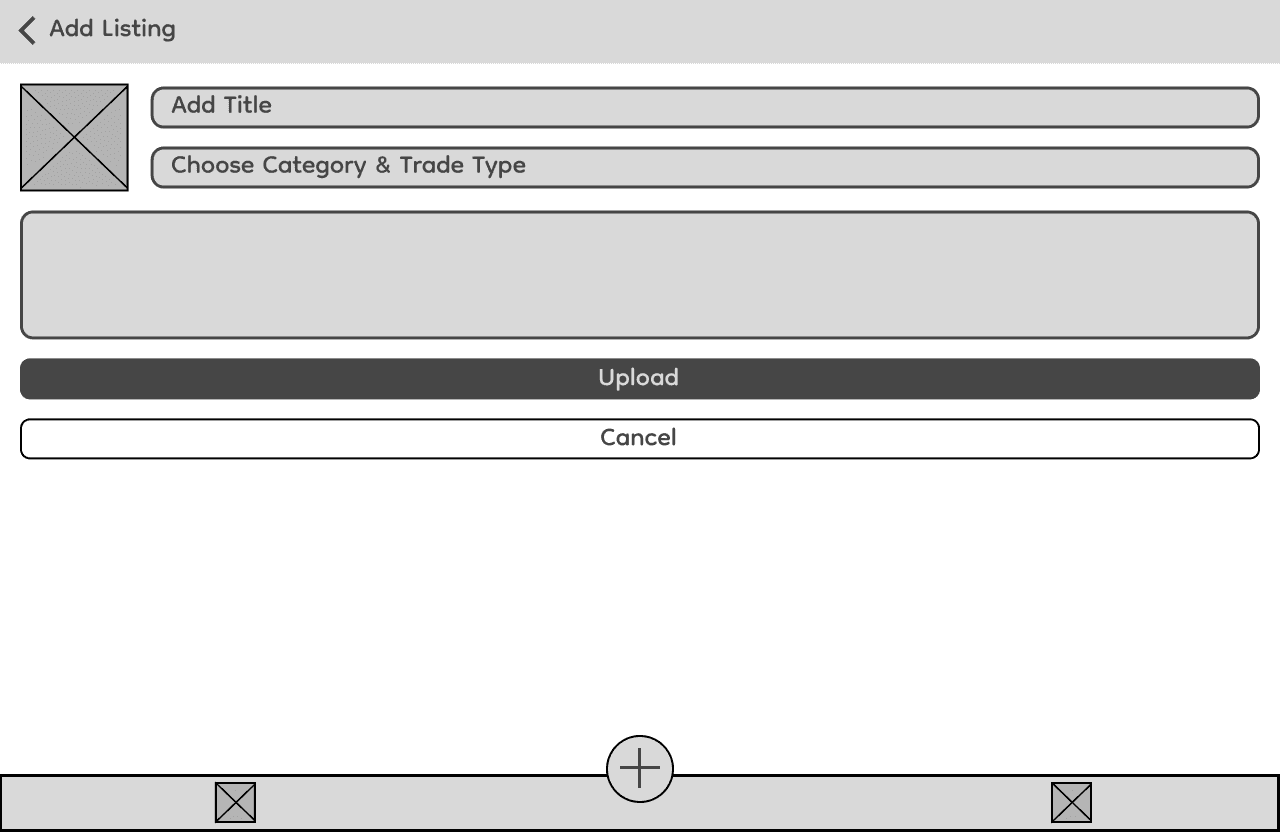
When adding a listing, the button which asks users to choose the category and trade type confuses them as there are two sections but there is only one button.
When adding a listing, the button which asks users to choose the category and trade type confuses them as there are two sections but there is only one button.
FINDING 3
FINDING 3
Users think it’s not very efficient to filter the items according to trade type and categories individually.
Users think it’s not very efficient to filter the items according to trade type and categories individually.
REFINING THE DESIGN
REFINING THE DESIGN
Following the usability study, I focused on refining the design to address user feedback and enhance overall usability. I developed mockups to improve the visual design and incorporate any changes identified during testing.
These mockups were then transformed into a high-fidelity prototype, offering a more polished and interactive version of the app for further evaluation. Additionally, I made sure to prioritiSe accessibility throughout the design process, ensuring the app is inclusive and usable for a diverse range of users.
MOCKUPS: BEFORE AND AFTER USABILITY STUDY
MOCKUPS: BEFORE AND AFTER USABILITY STUDY
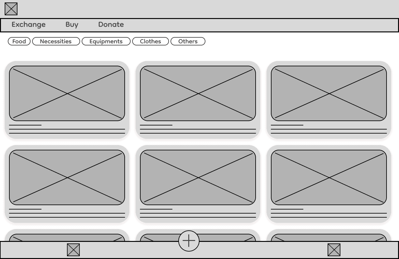
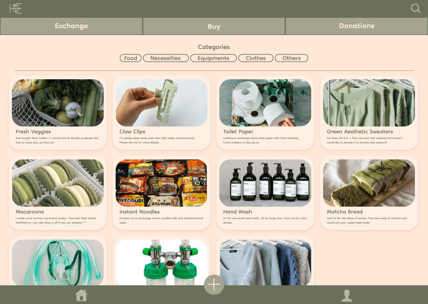
I added a divider between the filtering section and the card display area to clearly separate the two functions, making the layout more intuitive for users. This also helps to create a cleaner and more organised appearance. Additionally, I’ve also added a search function for users to search the listings instead of just filtering them.
I added a divider between the filtering section and the card display area to clearly separate the two functions, making the layout more intuitive for users. This also helps to create a cleaner and more organised appearance. Additionally, I’ve also added a search function for users to search the listings instead of just filtering them.
BEFORE
BEFORE


AFTER
AFTER


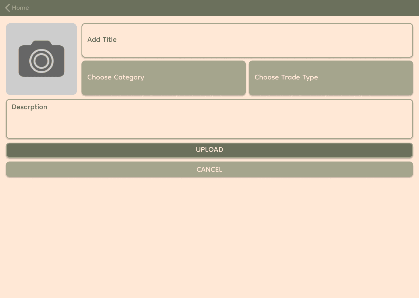
Instead of combining categories and trade types into one button, they’re now separated into two distinct buttons, making it clear that users need to select both when uploading an item.
Instead of combining categories and trade types into one button, they’re now separated into two distinct buttons, making it clear that users need to select both when uploading an item.
BEFORE
BEFORE


AFTER
AFTER


ACCESSIBILITY CONSIDERATIONS
ACCESSIBILITY CONSIDERATIONS
1
1
I made sure the colours met the WCAG guidelines and ensured strong colour contrast between text and background elements to enhance readability for users with visual impairments or low vision.
I made sure the colours met the WCAG guidelines and ensured strong colour contrast between text and background elements to enhance readability for users with visual impairments or low vision.
2
2
The design is optimiSed for one-handed use, making it more convenient and accessible for users who need to interact with the app while holding their device with one hand.
The design is optimiSed for one-handed use, making it more convenient and accessible for users who need to interact with the app while holding their device with one hand.
3
3
I established a clear text hierarchy across the app to guide users in navigating through different sections and information on the screen.
I established a clear text hierarchy across the app to guide users in navigating through different sections and information on the screen.
FINAL
FINAL
MOCKUP DESIGNS
MOCKUP DESIGNS
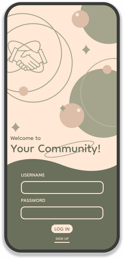


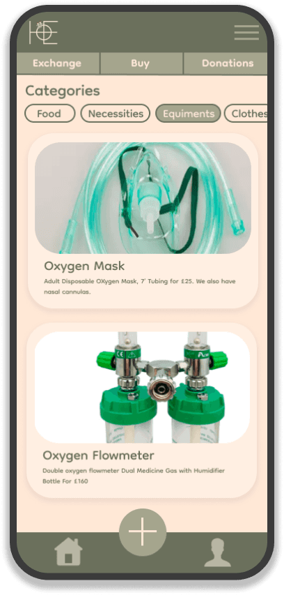


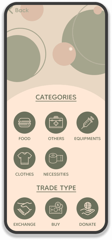


DESKTOP SCREENS
DESKTOP SCREENS
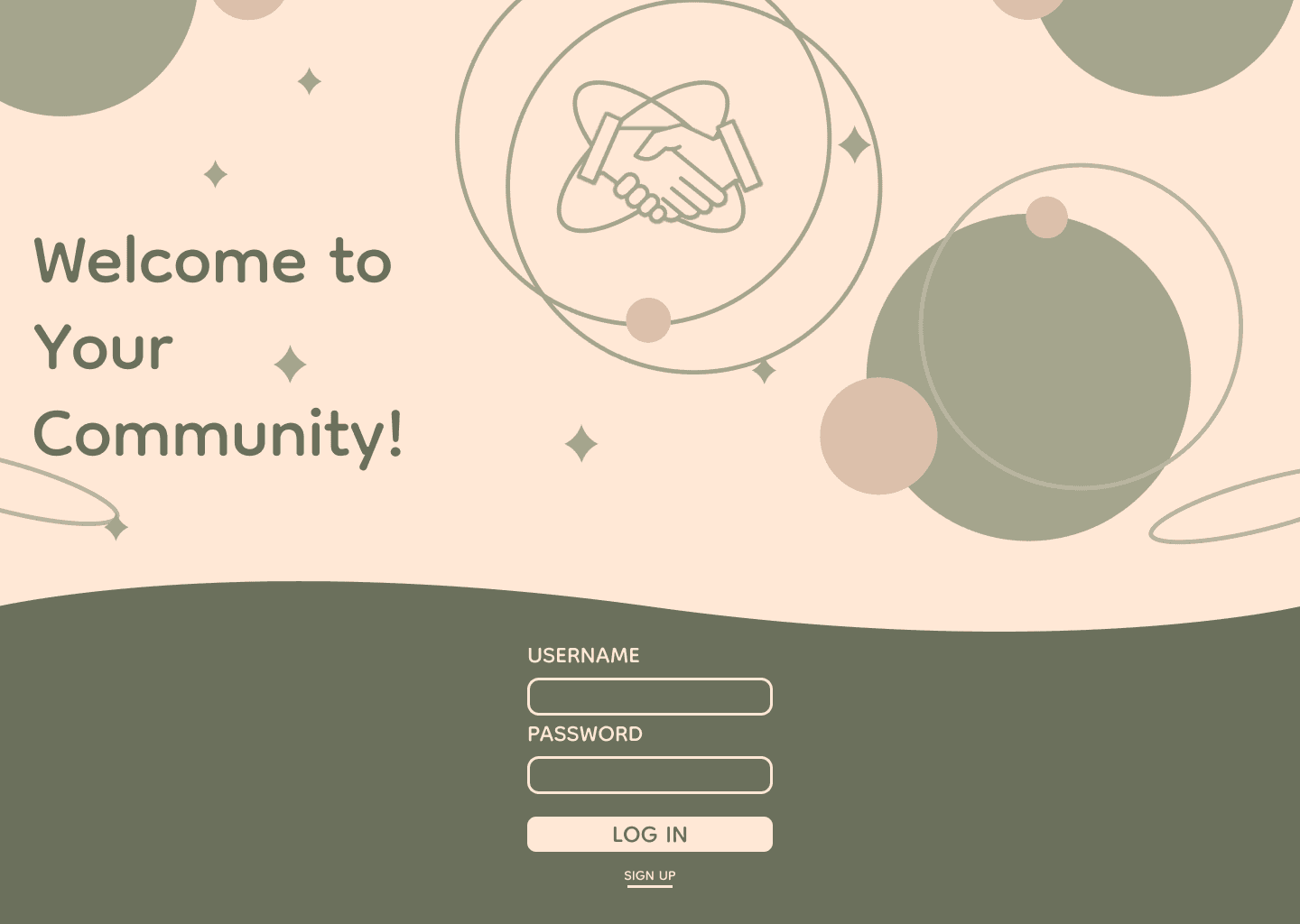


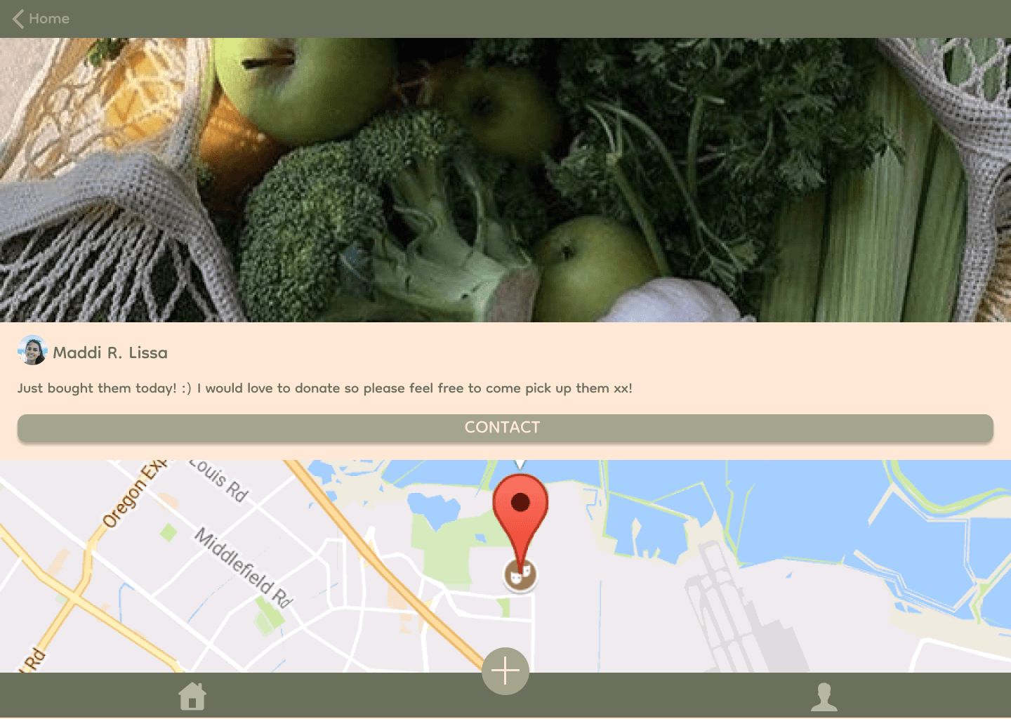


HIGH-FIDELITY PROTOTYPE
HIGH-FIDELITY PROTOTYPE
HIGH-FIDELITY PROTOTYPE
SOFTWARE DEVELOPMENT
SOFTWARE DEVELOPMENT
LocalLift was developed by using React Native which is an open-source UI software framework created by Facebook. The app is a cross-platform mobile app meaning that, it is available for both iOS and Android.
The best way to test a mobile app is by testing it out on a real device as this gives the highest accuracy. Simulators and emulators are also popular for testing mobile applications. In our case, participants for the user feedback survey used their own device.
IMPACT
IMPACT
Overall, the application met its initial requirements and 80% of the participants in the survey agreed that the app would be useful for local communities to help each other during times of crisis
Overall, the application met its initial requirements and 80% of the participants in the survey agreed that the app would be useful for local communities to help each other during times of crisis
“I like the user interface and the colour scheme, i don't think it needs anything more other than what is already implemented”
“I like the user interface and the colour scheme, i don't think it needs anything more other than what is already implemented”
HOW I FEEL TOWARDS THIS PROJECT
HOW I FEEL TOWARDS THIS PROJECT
This is a project I am most proud of as it was my first time being both the designer and developer of an entire application by myself in a short amount of time. It was also my first time carrying out the entire UX design process which helped me learn a lot about user experience and user research. Also, I was inspired by how my home country (Myanmar) was facing the pandemic, including myself who lost loved ones during it. Therefore, I am glad I was able to design a product that can help people during times of crisis like this in the future.
This is a project I am most proud of as it was my first time being both the designer and developer of an entire application by myself in a short amount of time. It was also my first time carrying out the entire UX design process which helped me learn a lot about user experience and user research. Also, I was inspired by how my home country (Myanmar) was facing the pandemic, including myself who lost loved ones during it. Therefore, I am glad I was able to design a product that can help people during times of crisis like this in the future.
WHAT WOULD I HAVE DONE DIFFERENTLY?
WHAT WOULD I HAVE DONE DIFFERENTLY?
I would extend the design beyond the mobile version to encompass a desktop version, thus enhancing accessibility across devices. Furthermore, incorporating multiple languages into the application would be a valuable addition, breaking down language barriers and ensuring a more user-friendly experience for a broader audience
I would extend the design beyond the mobile version to encompass a desktop version, thus enhancing accessibility across devices. Furthermore, incorporating multiple languages into the application would be a valuable addition, breaking down language barriers and ensuring a more user-friendly experience for a broader audience
SEE OTHER PROJECTS
SEE OTHER PROJECTS
